Sales Planning
Project Overview
Creating a net-new product for Salesforce - Sales Planning. This project will show a highlight of the end-to-end design process required to take a new product from vision to shipping.
My Contribution
I was the first designer on Sales Planning. The launch date for the project was moved up, so a team of three other designers joined me to expand the design bandwidth for each sprint.

Context
What is sales planning?
Sales planning is a process where businesses plan, manage, and control their sales strategy. It involves assessing their past sales performance and identifying areas where it can be improved.

Problem
Today, sales planning activities are often siloed and disorganized. Customers rely on external data sources and tools (like excel or google sheets). Data sources are out-of-sync and organizations have to struggle to create accurate plans.
Over 62% of customers are using spreadsheets for sales planning.
Pain Points
It’s time consuming, difficult, tough to collaborate, and is siloed in the spreadsheet rather than being usable by the other sales software they use.

Project goals
Create a tool that can simplify the complex and inefficient process of sales planning.
Allow for data to move through the plan making it easier to start, put together, and complete - and to update throughout the year when needed.
Northstar: Make something better than spreadsheets.

Understand and Define
Market research
We conducted an audit of other sales planning services to understanding the market and product offerings out there. We found out the range of feature sets, uncovered best practices, and identified how we were able to differentiate ourselves in the market.

Defining users and goals
We were pretty sure we knew the user types for this project because we know how existing Salesforce products were being used. But we needed to test those assumptions before moving forward, so we asked the UX Research team to conduct a study.
With their efforts, we were able to detail the key user roles and what they were trying to accomplish during sales planning.

Jobs to be done
Salesforce has moved away from personas and operates using the jobs to be done methodology. This winds up being a more realistic reflection of actual user behavior, because certain jobs might be performed by multiple roles.
So we took the roles we identified from the study and broke down their behaviors and goals into jobs to be done.

User swimlanes
Next, I mapped the jobs to be done into high level user journeys. There was still too much ambiguity to create detailed user journeys, so we used rough swimlanes.

Working in Scope
Identifying the scope of our MVP
The research and jobs to be done exercise showed that this project had a massive scope. We found that an effective sales planning tool requires at least 10 sub-products to be useful to a customer. So how do you start working to build something like that?
We used the keystone approach - start with the central functions to build an MVP, and then add features on from there.
We choose to develop an essential set of features - three interaction areas that were so interconnected they had to be designed together.
Hierarchy: How you divide up the people and territories in your org
Alignment: What territories are being assigned to which people
Allocation: Defining the metrics those people and territories have to reach

Whiteboarding
Now that we knew what we were trying to build, we held whiteboarding workshops. After a couple sessions, we had a good idea how to segment the user interactions on a micro and macro level and how the user would flow through the MVP.

User flows
We were focusing on a narrow scope for the project, but needed to think about the system as a whole. User flows helped me to understand how a user would navigate through other areas of the product.
More importantly, we were able to think about how the user would move their data in and out of Salesforce to make sure this product didn’t exist in a silo. Otherwise, it wouldn’t be better than spreadsheets.

Interaction and component audit
We broke the user flows down into the fine grained interactions and components that would be required for a user to move through the MVP.

Steel thread user flow to keep MVP in scope
With a better idea of what would actually be required to include in our scoped product, we developed a steel thread user flow. It helped us stay focused on our scoped MVP, and worked as a project management tool.

Designing and Iterating
Sketching layouts and interactions
We knew what we needed to include in the product, but no idea what it would look like. I did whiteboard and paper sketching to quickly iterate on layout and component designs.

Wireframing
I explored our layout possibilities in wireframes to continue iterating rapidy.

Developing and iterating lo-fi designs
I moved into lo-fi designs to focus on specific components within the layouts.


Component design
During this time we were also working on the fine-grained interactions of components like the progress cards. Depending on what we put into these cards, the interactions on the page as a whole could change dramatically. On a project like this, everything had to be examined from both a macro and micro level.

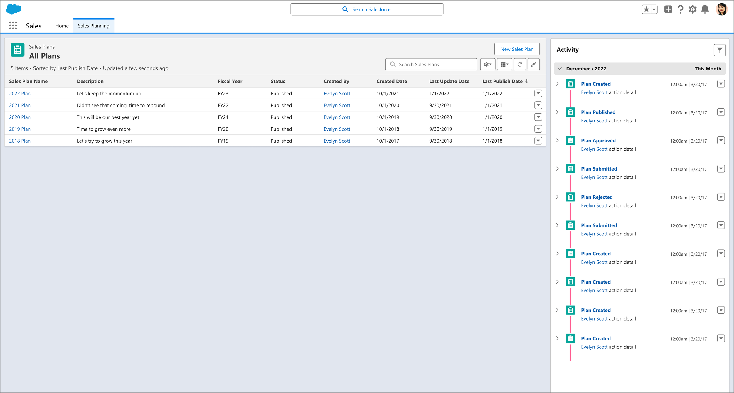
Design v1
We finally arrived at the first set of full fidelity mocks. We used those to build a quick prototype for feedback from solution engineers (salesforce employees who work directly with customers to identify needs). There was a lot that was right with the design, but a lot of issues that were uncovered.
Key problems with the design:
The navigation wasn’t working. We thought they would want to move between different planning “what-if” scenarios quickly. They didn’t.
The core mechanic of using a modal to assign and allocate didn’t allow for previewing changes
The collaboration would be difficult because the what-if scenarios would require version control
Final Verdict: Not better than spreadsheets

Design v2
We took the feedback and revised the design, moving from a browser experience to a builder app shell experience. This helped us simplify a lot of interactions and collaboration issues. But after a second set of feedback from SE’s, we uncovered additional issues.
Key problems with the design:
The segmenting and hierarchy navigation wasn’t intuitive enough
The progress cards were unclear in what they were referencing
The modal experience allowed for previewing, but didn’t allow for adding/removing table items once it was launched
Final Verdict: Still not better than spreadsheets

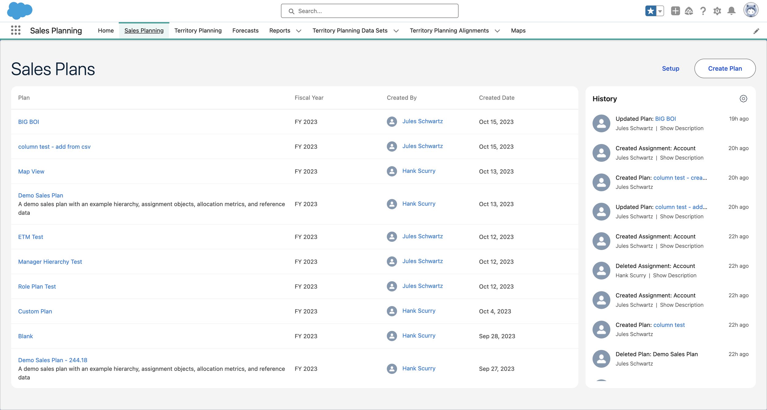
Design v3
The third design was a success. It further simplified the navigation and user flows, and allowed for better collaboration. There was no need for version control because it got rid of the what-if scenario method we had been trying. It allowed the user to pull info from salesforce, work on their plan, and update their org all in one space. It accomplished all of our key project goals.
Final Verdict: Better than spreadsheets

Usability testing and validation
Now that we had a solid design, we wanted to continue refining it directly with users. I ran usability studies on different components and interactions using scoped prototypes. Importantly, I would run most studies with two groups: people who regularly used Salesforce, and people who did not. I wanted to make sure that all the designs were intuitive enough that people could use them even with no prior knowledge of the product.
We also ran the designs through final checks with the accessibility team and the content writing team.


Creating a design library
With a finalized design, we built component libraries to standardize design assets for future efforts. These included layouts, components, color palettes, etc.

Post Launch
Effect on the larger sales org
Tracking the impact of a design project is important. According to the data team, this project directly impacted the business of Salesforce, especially the Sales Cloud. Adoption went up by over 34% and attrition fell 3.3%.


Upgrading the Salesforce design system
Since the MVP launched, the team started upgrading the UI. Leadership has used it as launchpad to upgrade the overall Sales Cloud design system -going from “Lightning Design System” to a version nicknamed “Kondo”.

Current live product after upgrade
This is a comparison of the original landing page and the current “Kondo” version that’s live. It’s a heavy lift for the teams, so it’s being upgraded in sections rather than all at once.