Accessible Design for Maps
Summary
Improve the accessibility of Salesforce Maps in two key areas - creating map markers that exceed WCAG 2.1 guidelines, and making a color-blind friendly color palette for marker selection.
My Contribution
I was the only designer on this project. Everything from the research to the final designs was my work.

Context
Project description
This was an add-on to another project - the redesign of the marker layer builder. We knew this could be such a high value feature that it justified additional resourcing.
This project involved extensive usability research with the color-blind community to get a successful product.
6 rounds of usability research
Over 90 participants
6 design iterations

Problem
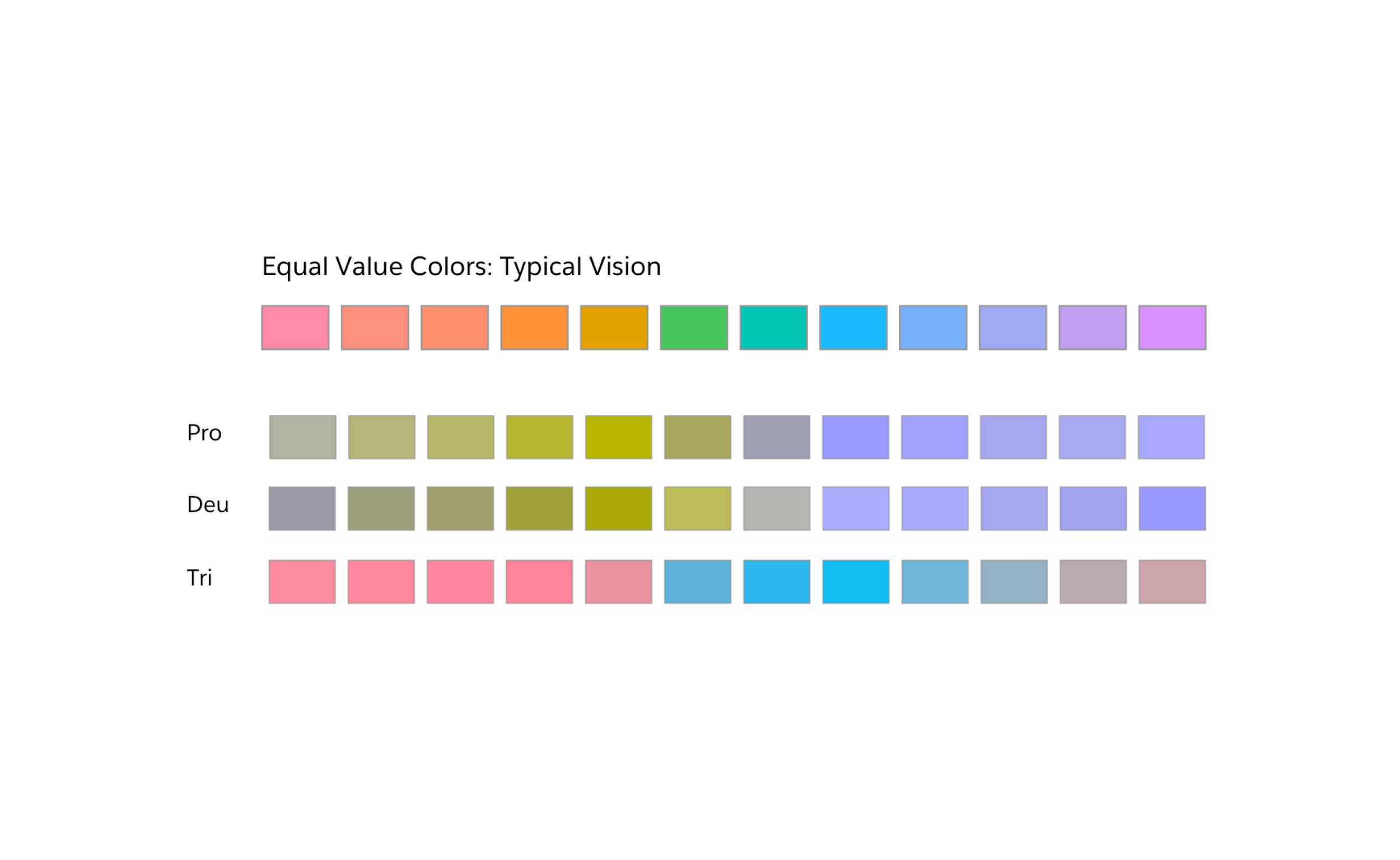
Maps don’t just need to show you where something is, but what that item is. Salesforce Maps makes that more complicated by showing multiple categories, usually distinguished by the color of its marker.
The original designs and interactions had no way to ensure that the markers were visible and distinguishable by everyone.

Why is this important to our customers?
Imagine a service representative needs to repair a broken machine for a customer and that customer’s location is highlighted on a map. If the service rep has color blindness, they might not be able to distinguish which marker is highlighted. That could cost them time and money from lost business.
Improved accessibility is important for inclusion, and helps the bottom line for businesses.
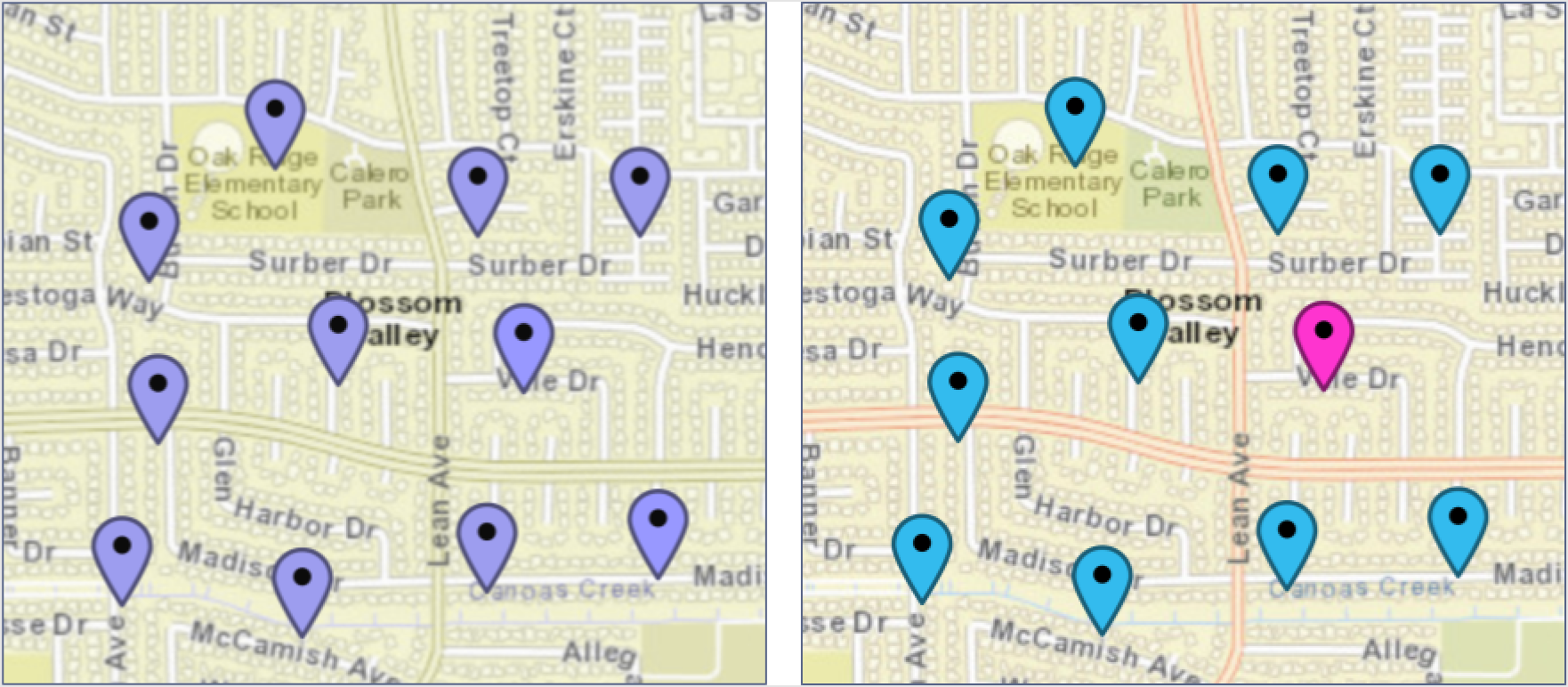
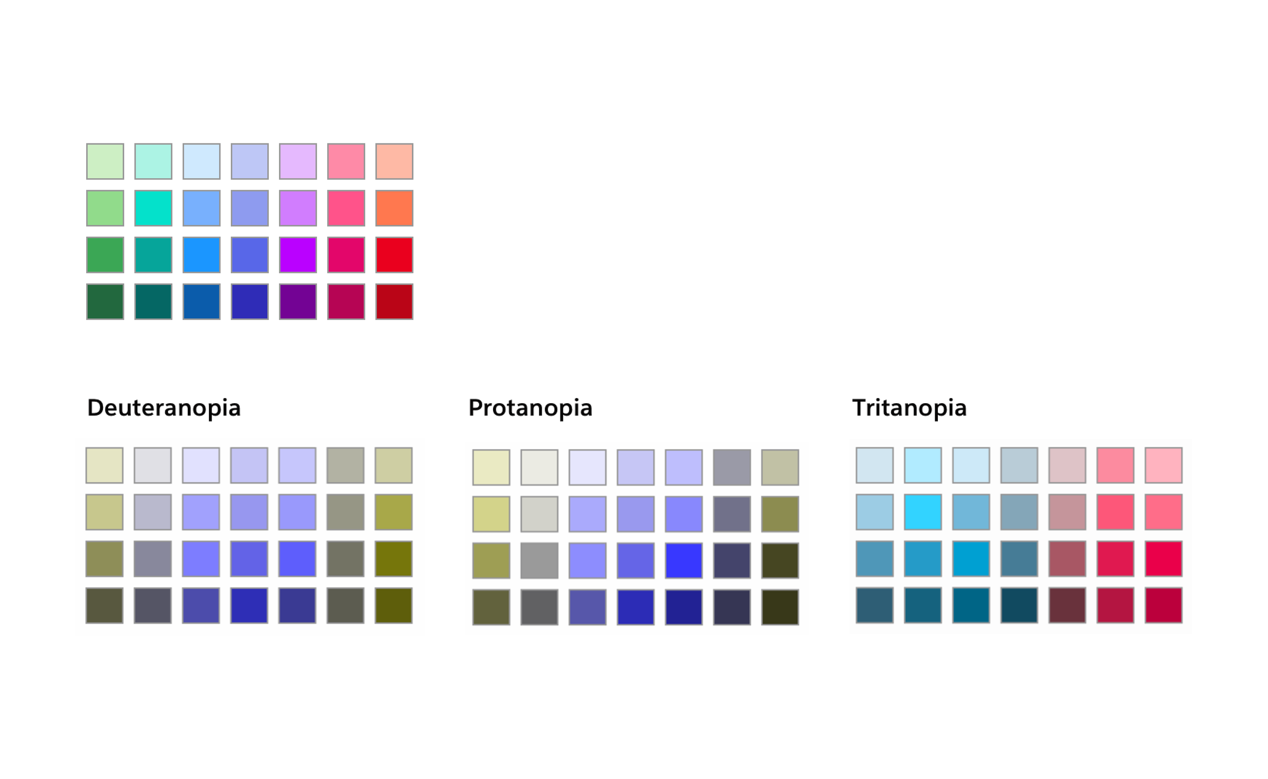
Left: What a map looks like to someone with typical vision. Right: What the same map might look like to someone who has color blindness.
Our solution and goals
Create a color blind-friendly color palette that anyone — especially someone with color blindness — can set up.
Create markers that meet contrast requirements for better visibility.
High-contrast Map Markers (the quick fix)
Problems with the original marker
Hard to distinguish from the background. Borders don’t always meet contrast guidelines for map backgrounds or the marker interior. No drop shadow. Border is thin, so has similar weight to many background components like roads.

Using accessibility guidelines (WCAG)
I used the WCAG as a guide for all the work on this project.
WCAG has guidelines on required contrast for people with moderately low vision for different interaction elements
Map markers fall into WCAG category of “Objects that are functional; can be interacted with.”
So markers need to have greater than 3:1 contrast ratio

Comparative research
To start the project, I performed an audit of other mapping services to identify existing design patterns and best practices. The main thing I uncovered is that none of the other services had markers that passed WCAG guidelines. But I was able to find some design elements that I could incorporate into my designs.

Design explorations and iterations
Using the research on the WCAG and audit of other maps, I went through variations of marker designs to enhance contrast ratios with the background. The two biggest levers for change were the border (weight, color, and doubling) and the drop shadow.

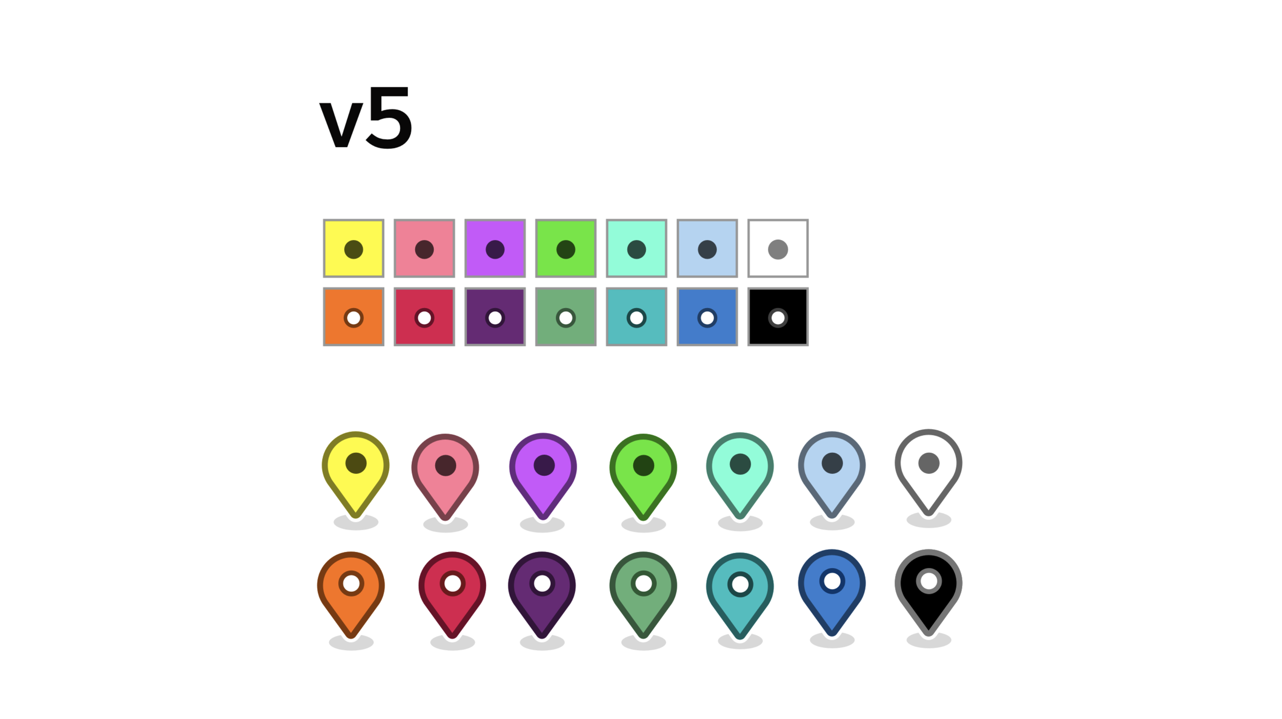
Finished markers
Double border insures that there will always be high contrast between marker and background
Future-proofs markers against any changes in background map tiles
Dot in center changes accord to WCAG contrast guideline (dark dot for light marks, light dot for dark markers)
I used HSL (hue/saturation/lightness) color method for borders and dots

Color-blind Friendly Color Palette
Problem
There is currently no subpalette, only open picker
Means users can create color sets that are not accessible for CVD
Especially because Maps builder has an “assign random colors” to categories

Research
I did a deep dive on color-blindness research and how to develop color-blind friendly palettes.
Issues:
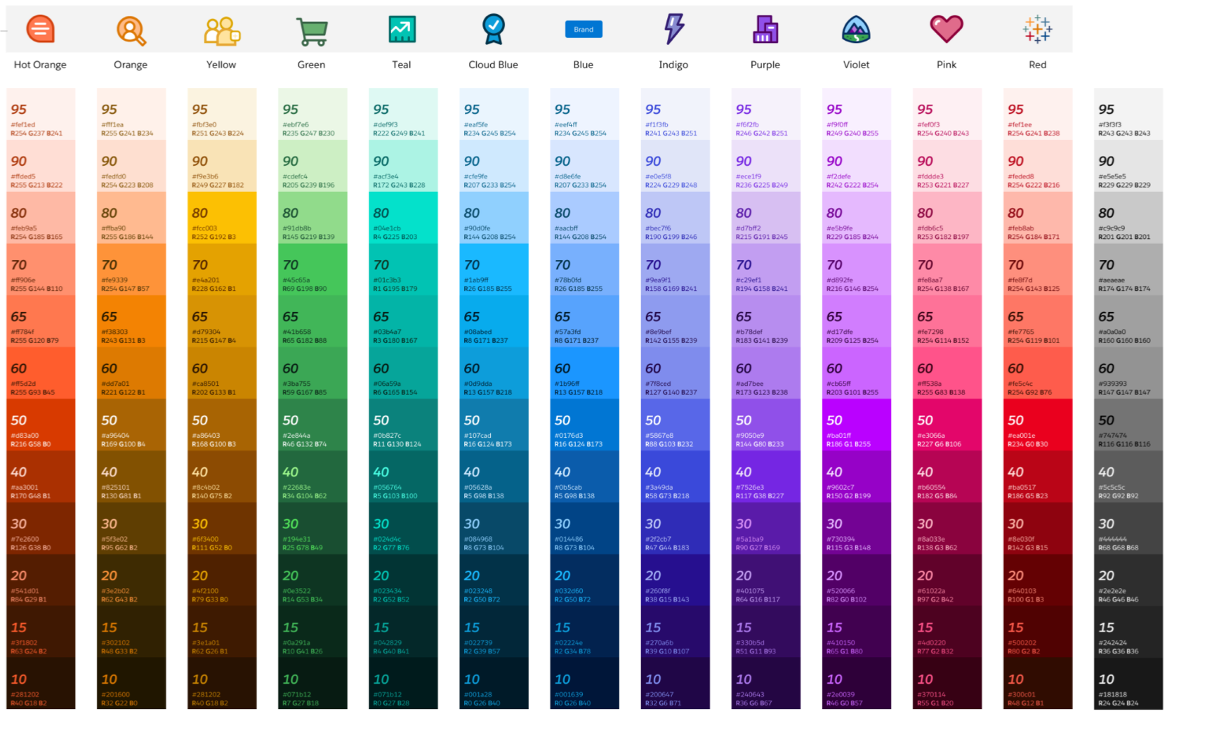
CVD palette standard practice is to have AT MOST 8 colors
Available palettes weren’t designed to be visible on maps (too light, too dark, and/or too desaturated)
Aren’t connected to our SLDS branding

Starting with the Salesforce default color palette
Tried using existing Salesforce design assets. Unfortunately, it was not CVD friendly in automated tests and live usability testing.
“I can see is that there are 3 groups of colors on this palette, but I can’t tell apart the colors within each group” -Alexei R.

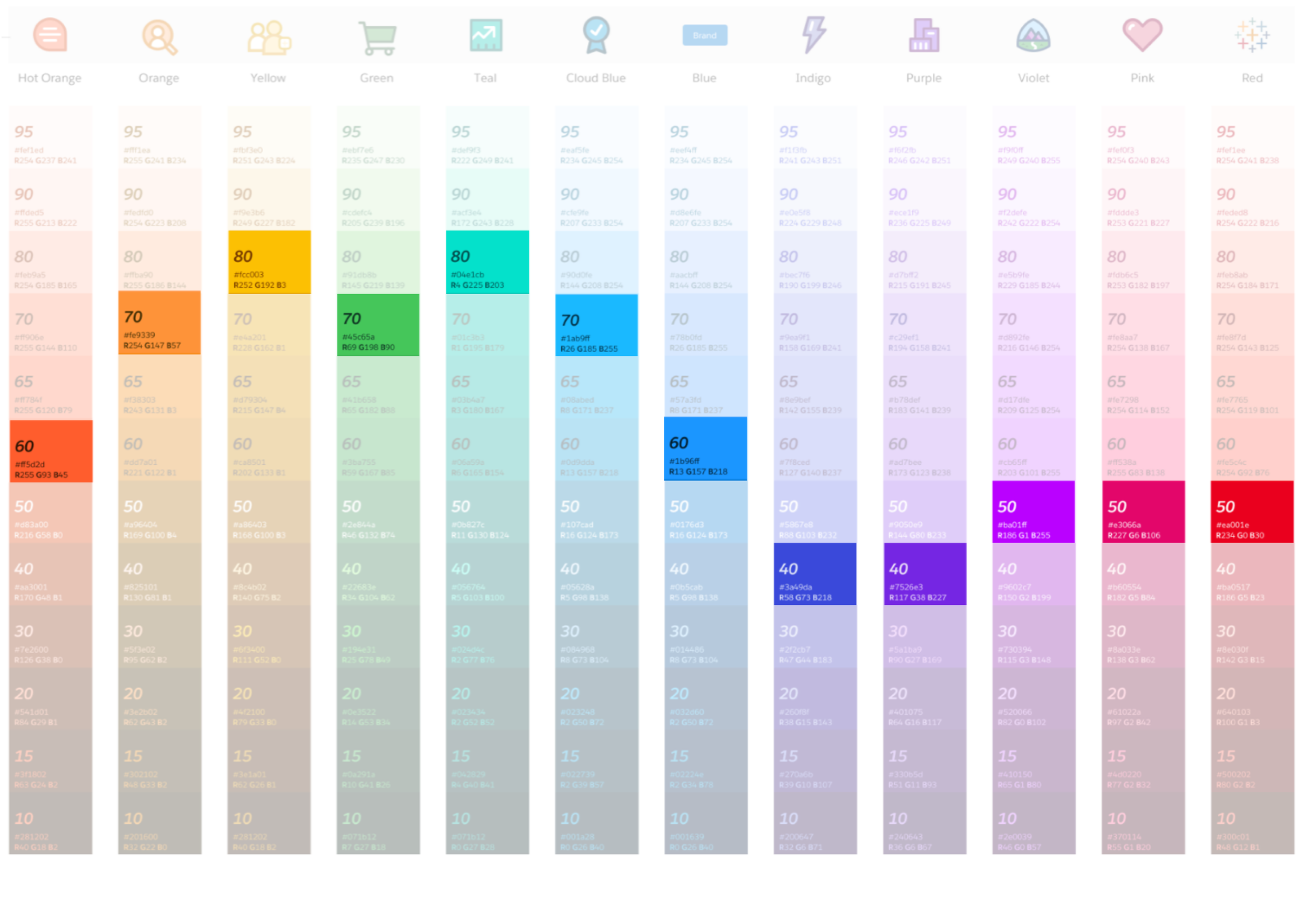
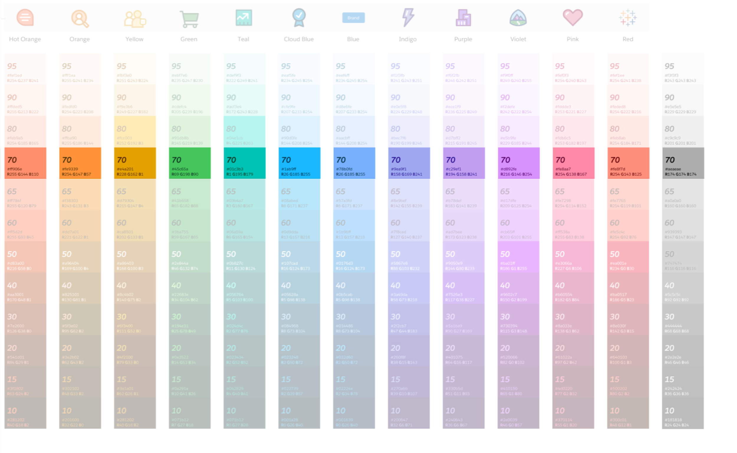
Expanding into the full SLDS palette
Examined the full SLDS color palette to create my own sub-palette. I eliminated colors that were too light for the map and too dark to tell apart from each other.
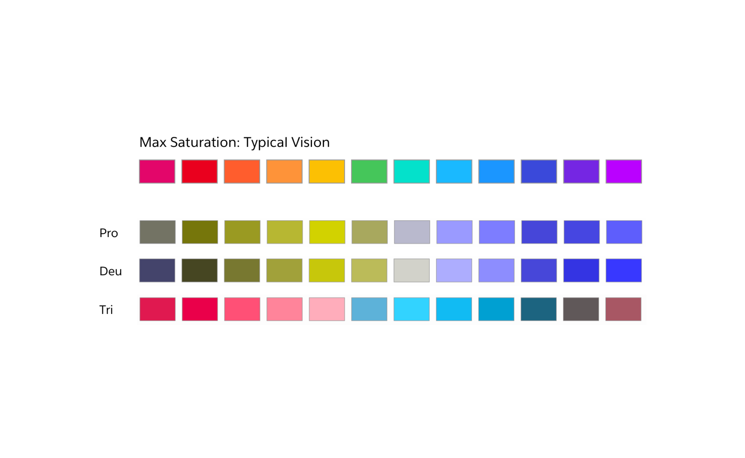
Then I tried a number of different selection methods (including equal contrast values and max saturation) and eventually developed a 28 color palette out of remaining colors with maximum differentiation.
“This is better than the last palette, but I still can’t tell most of them apart. When I see that many colors, It just gets overwhelming” -Lucy
What went wrong?
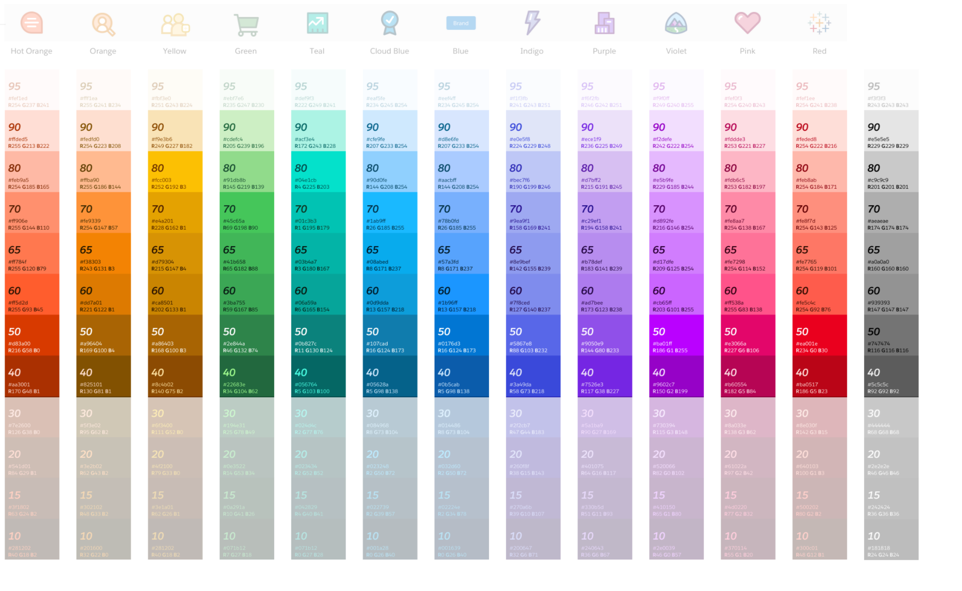
Looking at the SLDS palette, I found that it’s great for color contrast, but because it was created using RGB (red, green, blue), it’s difficult to create sub-palettes for CVD. The best way to create differentiation for color-blindness is by making changes using HSL (hue, saturation, light)

Moving away from SLDS
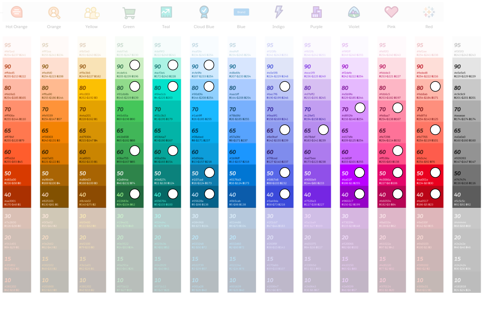
I developed a palette that had the Salesforce system as a starting point but expanded into different HSL values instead of RGB. It was a good start, but additional testing showed that there were still issues. In this palette, 9 out of 14 colors needed revision.
“These colors are mostly distinguishable when they’re next to each other like this, but pretty confusing when farther away from each other” - David K.

A breakthough!
During round 4 of testing, a color blind participant said something that inspired a major change in approach. There was no way I was going to find a set of 14 colors that were easily distinguishable at a glance. Not unless I used something that could give the colors additional context. So I added light and dark dots to give context clues. They were included on the map markers, so why not include them on the color picker component as well. It was an obvious change, but one I hadn’t thought of because I had never seen a color picker with context dots before.

5th round of testing
Feedback from this round of usability testing showed the palette was almost there, but had two colors that were tough to distinguish. With a slight change I was able to adjust the contrast ratio between them in a subtle but significant way.

Final user validation
The final round of testing was a huge success, with 100% of participants able to distinguish between all colors in the palette.
“This is the best version of a map I’ve ever seen!”
“This is the largest set of colors that I can easily distinguish between”

Finished Product
Handoff to engineers
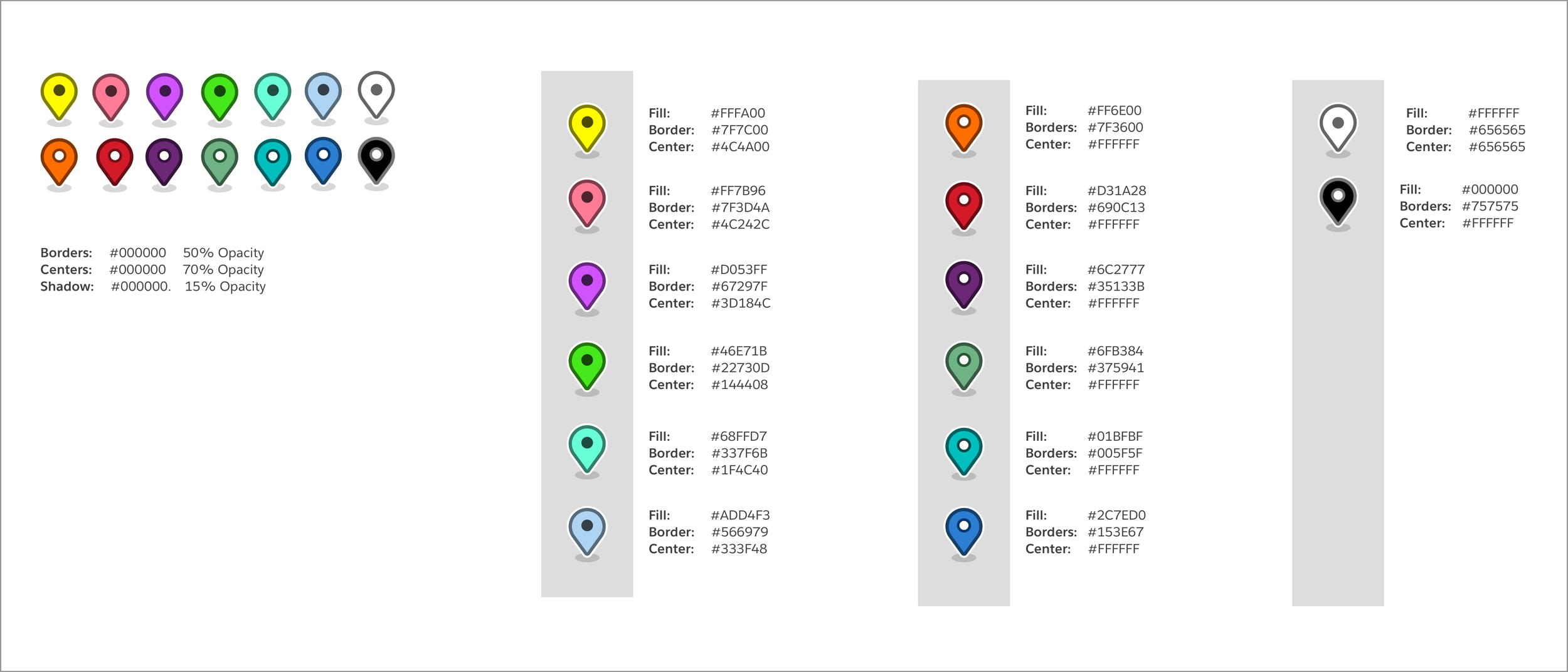
Because the final palette was outside of established Salesforce patterns, I created a spec doc for the dev team to implement the designs and be a reference for anyone who might join the team in the future.
Effect on Salesforce’s business
This project, as part of the Marker Layer Builder redesign led to:
38.59% increase in daily active users
20% y/y growth in revenue
