Marker Layer Builder
Summary
Full redesign of a core part of Salesforce Maps, with a focus on improving accessibility.
My Contribution
I was the only designer on this project. I was in charge of the UX direction and was the accessibility subject matter expert for the team.
Context
Project description
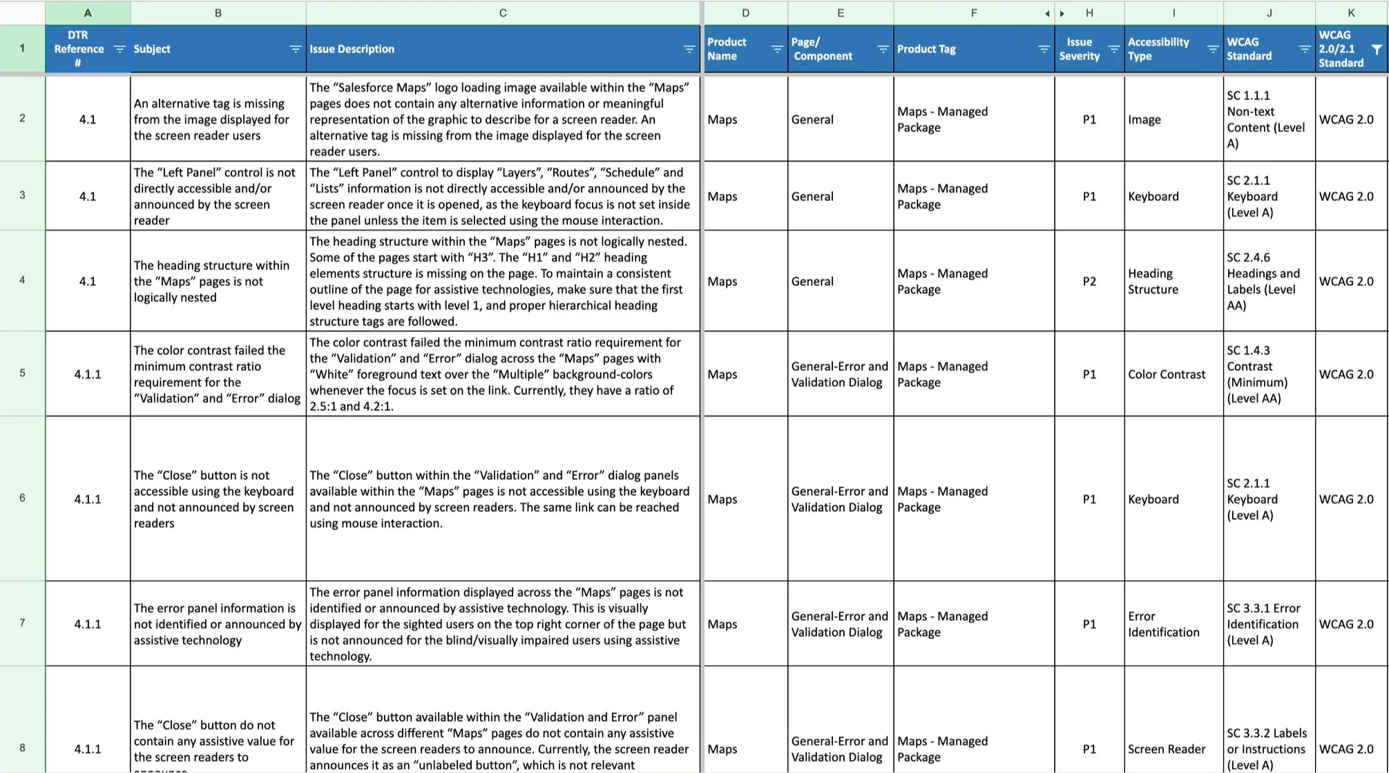
The marker layer builder was one of the first things built for Salesforce maps and it was showing it’s age. It had amassed years of tech and UX debt that had started to make the experience inefficient and convoluted. The final trigger was an accessibility audit showed that the builder had major accessibility gaps to resolve, so the team decided this was a great opportunity to update the builder and make sure it met current Web Accessibility Initiative guidelines (WCAG 2.0).
This was a redesign of an existing project, so I already knew some key information:
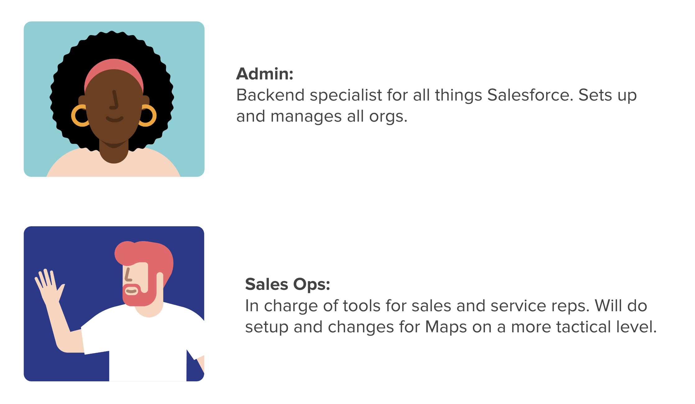
Users: Same users as the previous version: admins and sales ops.
Current Design Problems: Well documented by solution engineers and PM’s based on user feedback and UX researcher team
Product Requirements: What the product needs to accomplish when done, and what limitations there were.
Form Factor: Scoping of this project required that we use a modal rather than a new page experience
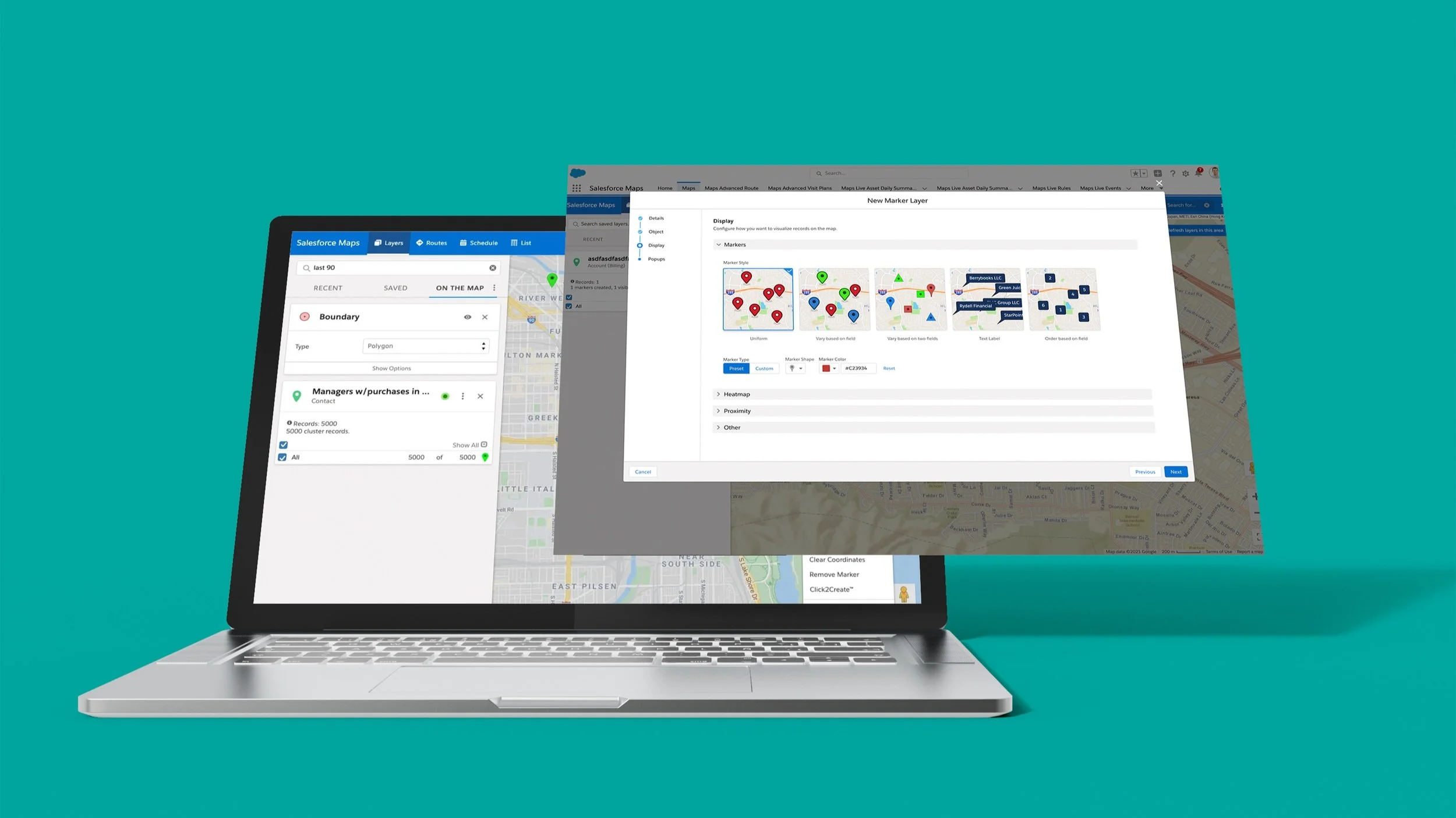
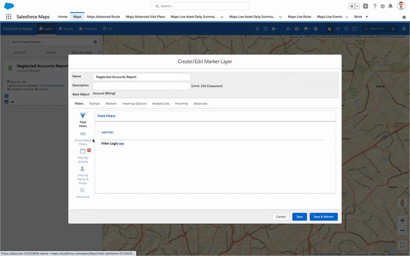
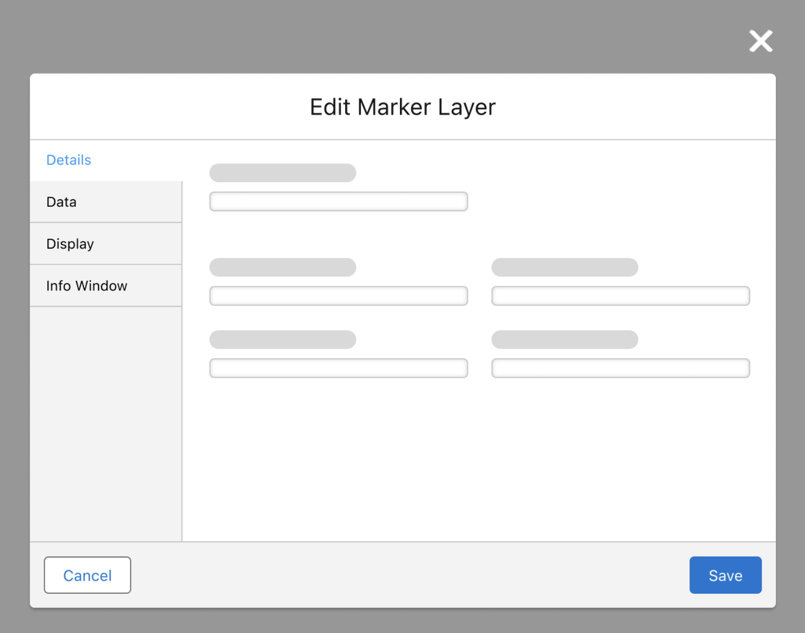
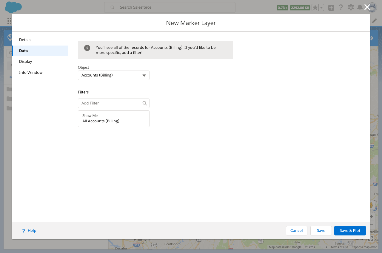
What is the marker layer builder?
The marker layer builder is the central configuration tool for maps. It’s how a user gets data out of spread sheet and onto a table. It includes what to display (locations, accounts, service areas) and how to display it (markers, labels, heat maps).
Problem
Massive UX debt
Unusable for keyboard navigation
Unusable for screen readers
Unusable without lots of training
Project Goals
Simpler: Redesign the “create new” and “edit” flows to be a easier experience with a much shallower learning curve.
Consistent: Update components to Salesforce design system
Accessible: Meet or exceed WCAG 2.1 guidelines
Backward Compatible: Make sure there is parity with the old builder
Scalable: Design must have flexibility to add future features
Understand and Define
Who are our users?
Because this was a redesign, we already knew who our key users were.
User Journey Audit
Detailed out the current user journeys to understand how the current product was being used. Also checking if there was any significant difference in the journeys between admin and sales ops (there wasn’t).
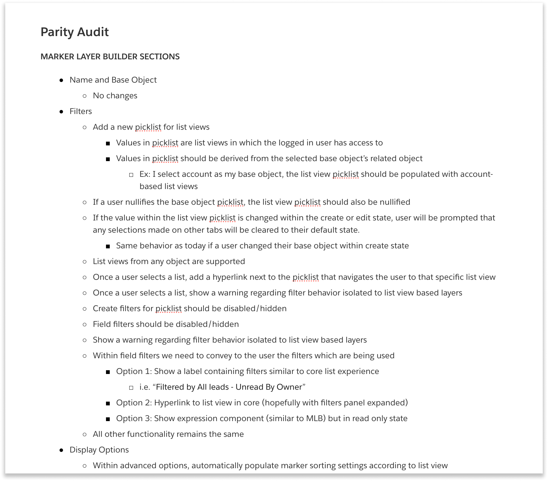
Feature audit and additions
I conducted an audit of existing features to make sure there would be functional parity between the old and new product.
There were marker layers out there already, so any design we made would have to support those, otherwise it could cripple a customers business operations.
This is also where we were able to list out any additional functionality that user’s had requested, and decide what to include in this update.
Accessibility study list
I took the accessibility study and mapped all the problems to the existing and proposed features. This helped inform all design decisions during the process to make sure we didn’t miss anything or repeat mistakes.
Information architecture workshop
We did card sorting to figure out the best way to distribute the existing (and new) features into groups, which gave us a clear information architecture.
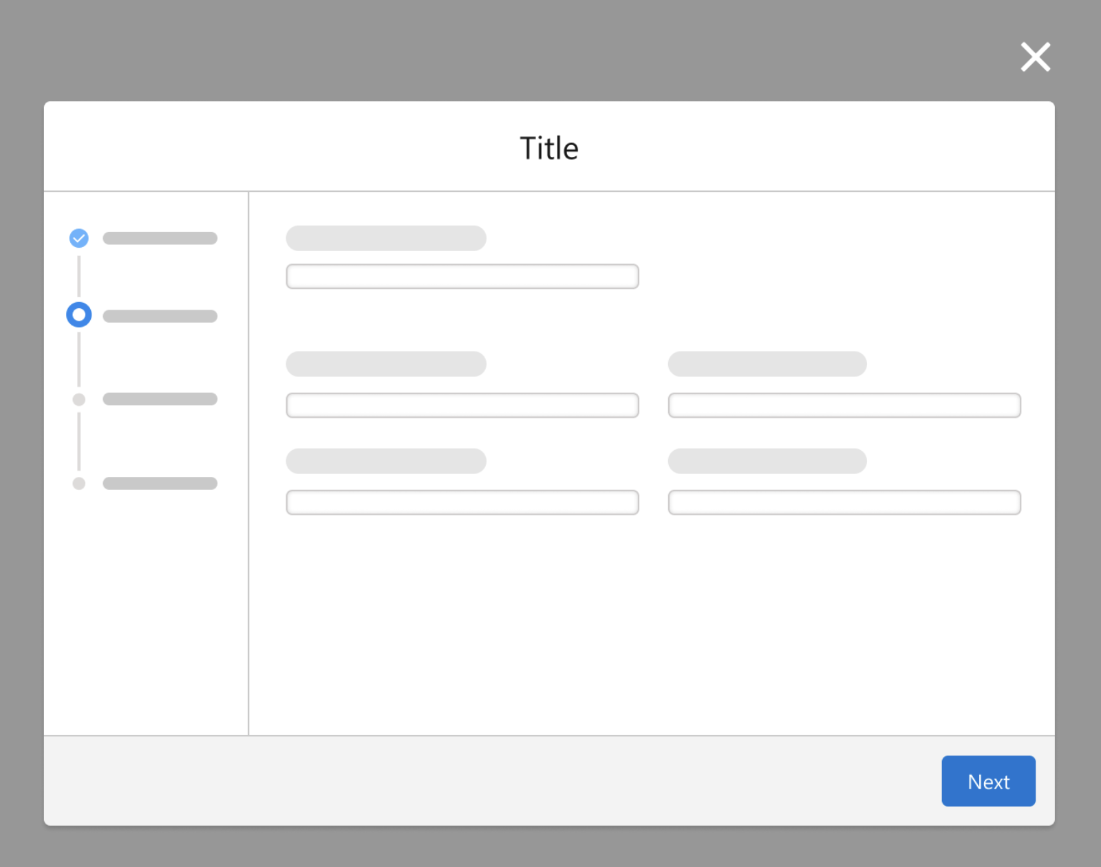
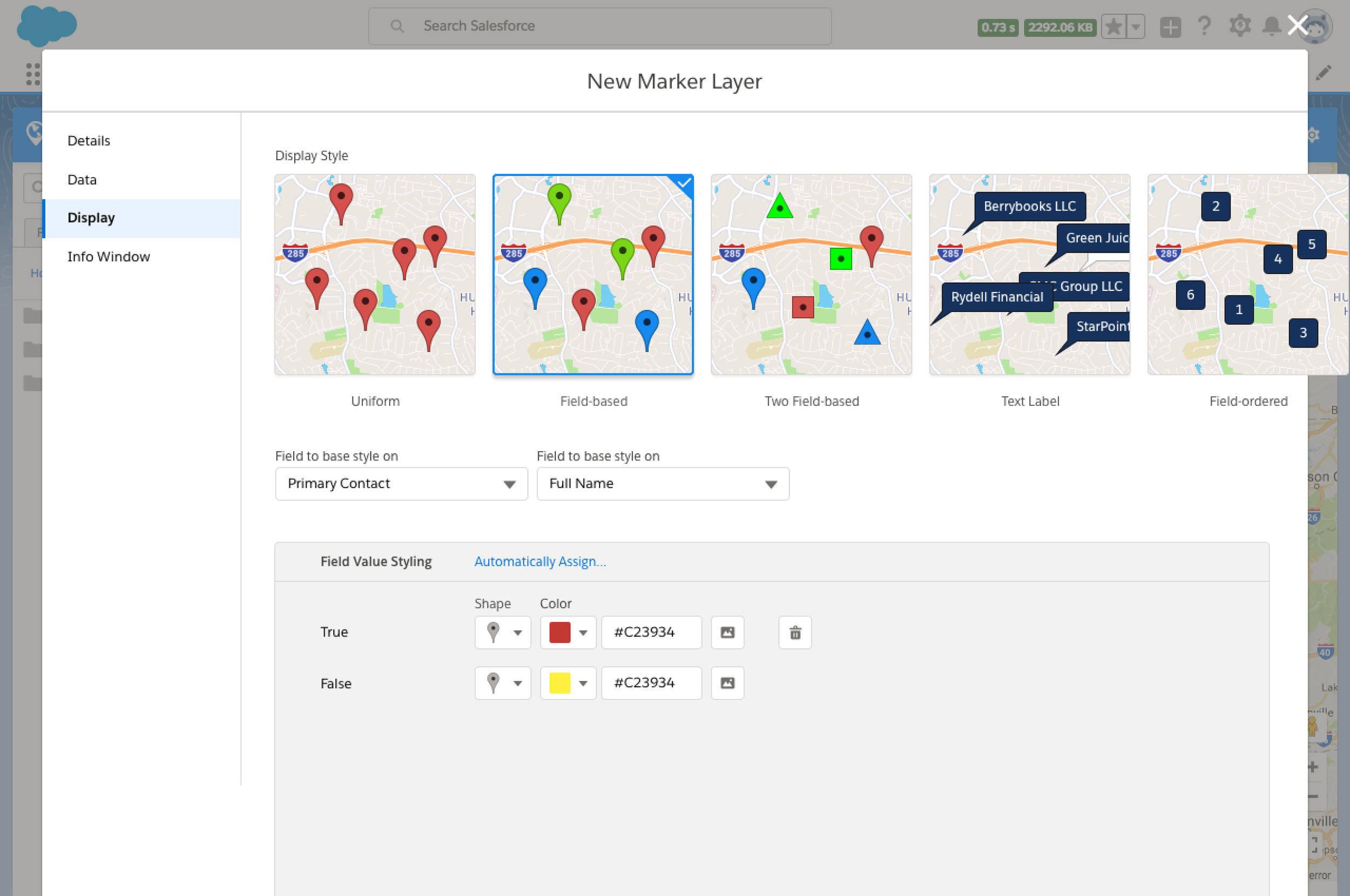
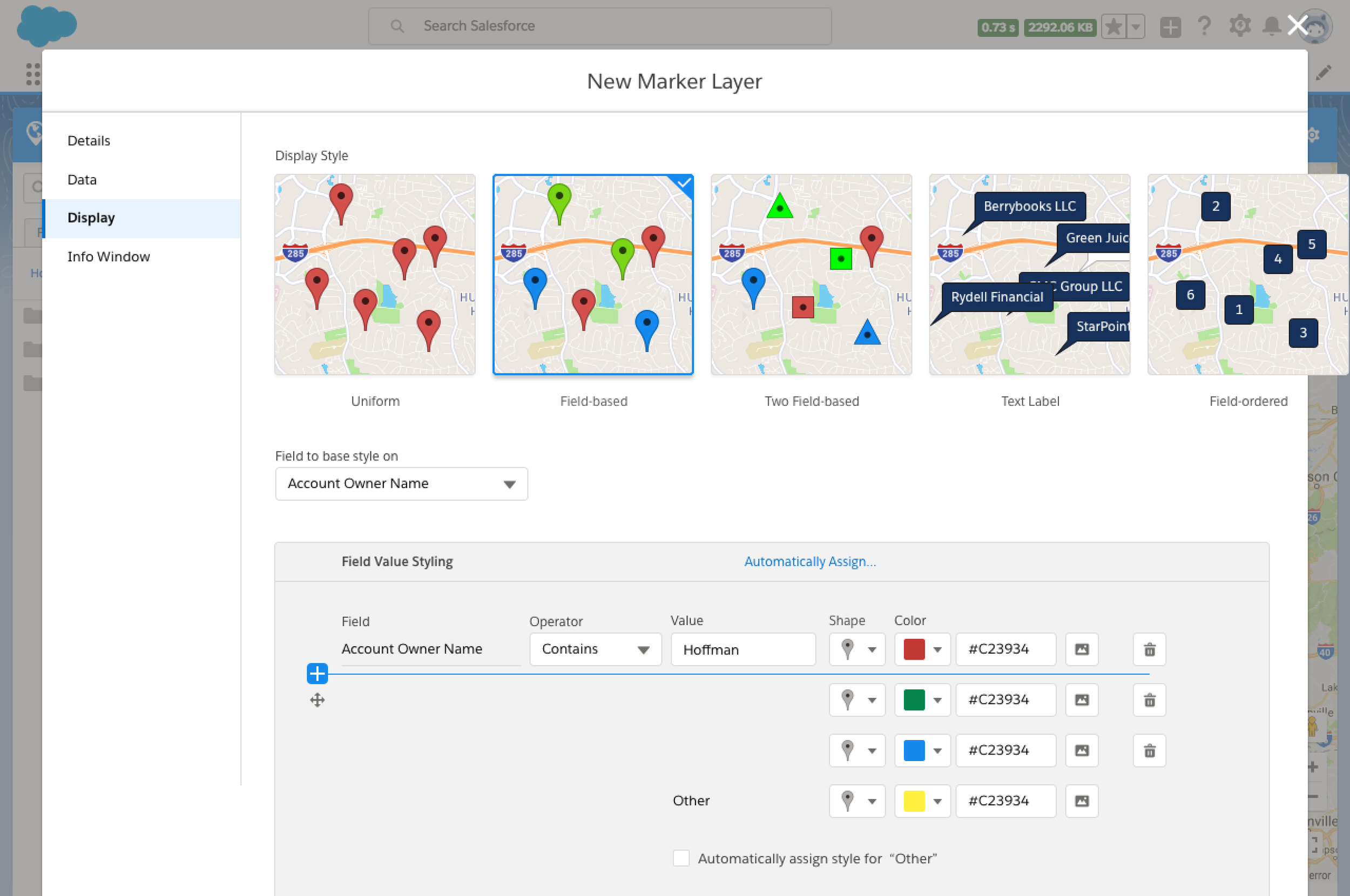
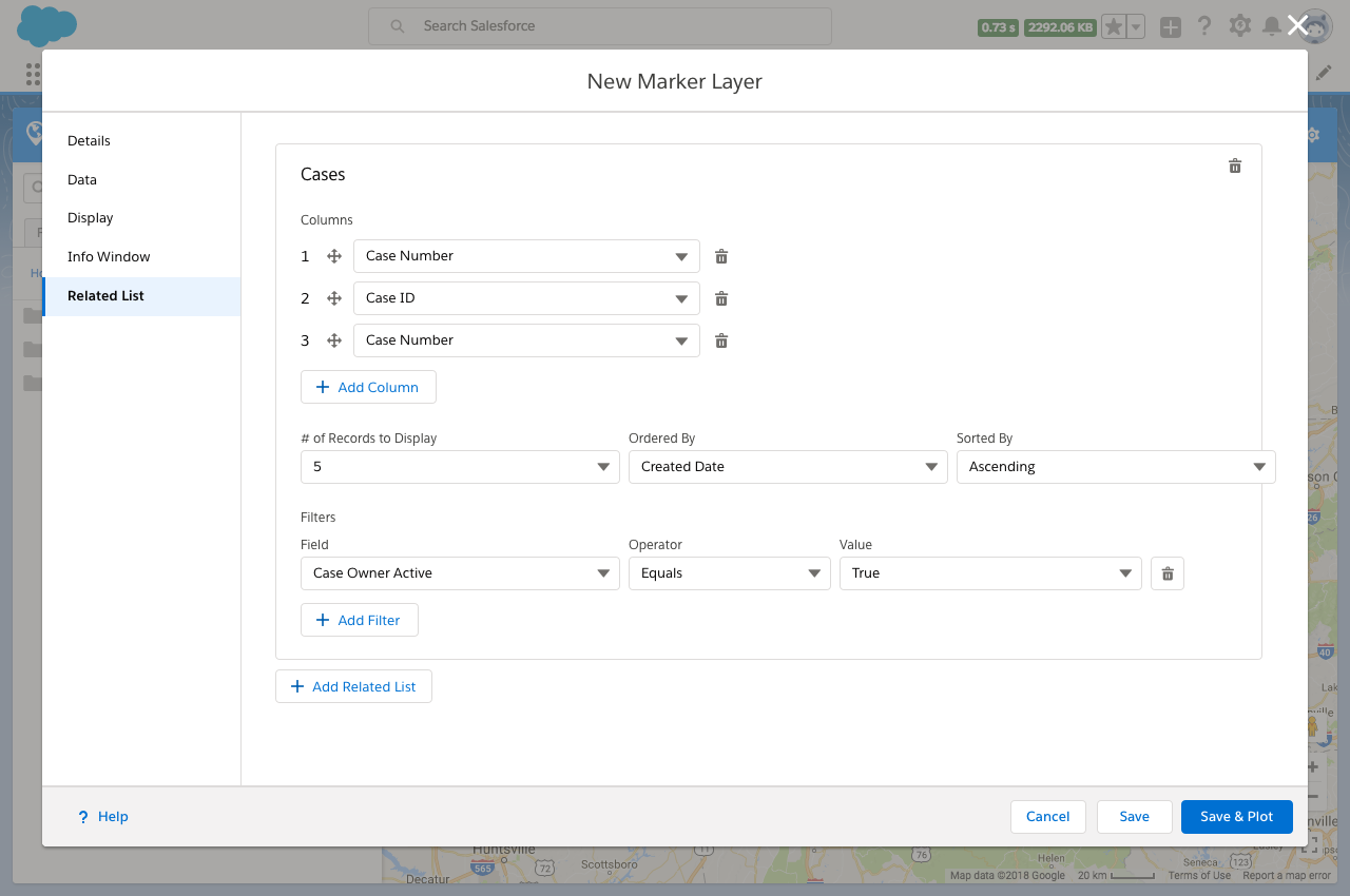
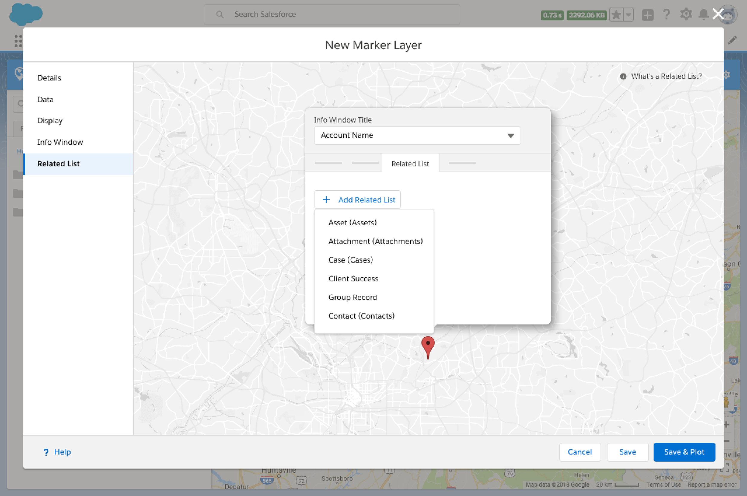
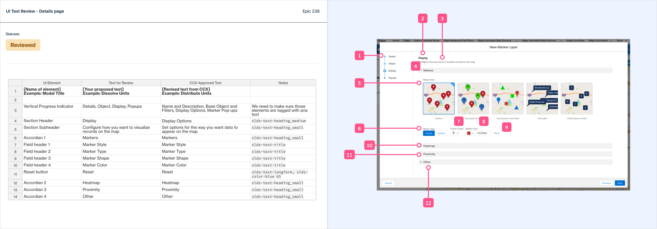
Details
Data
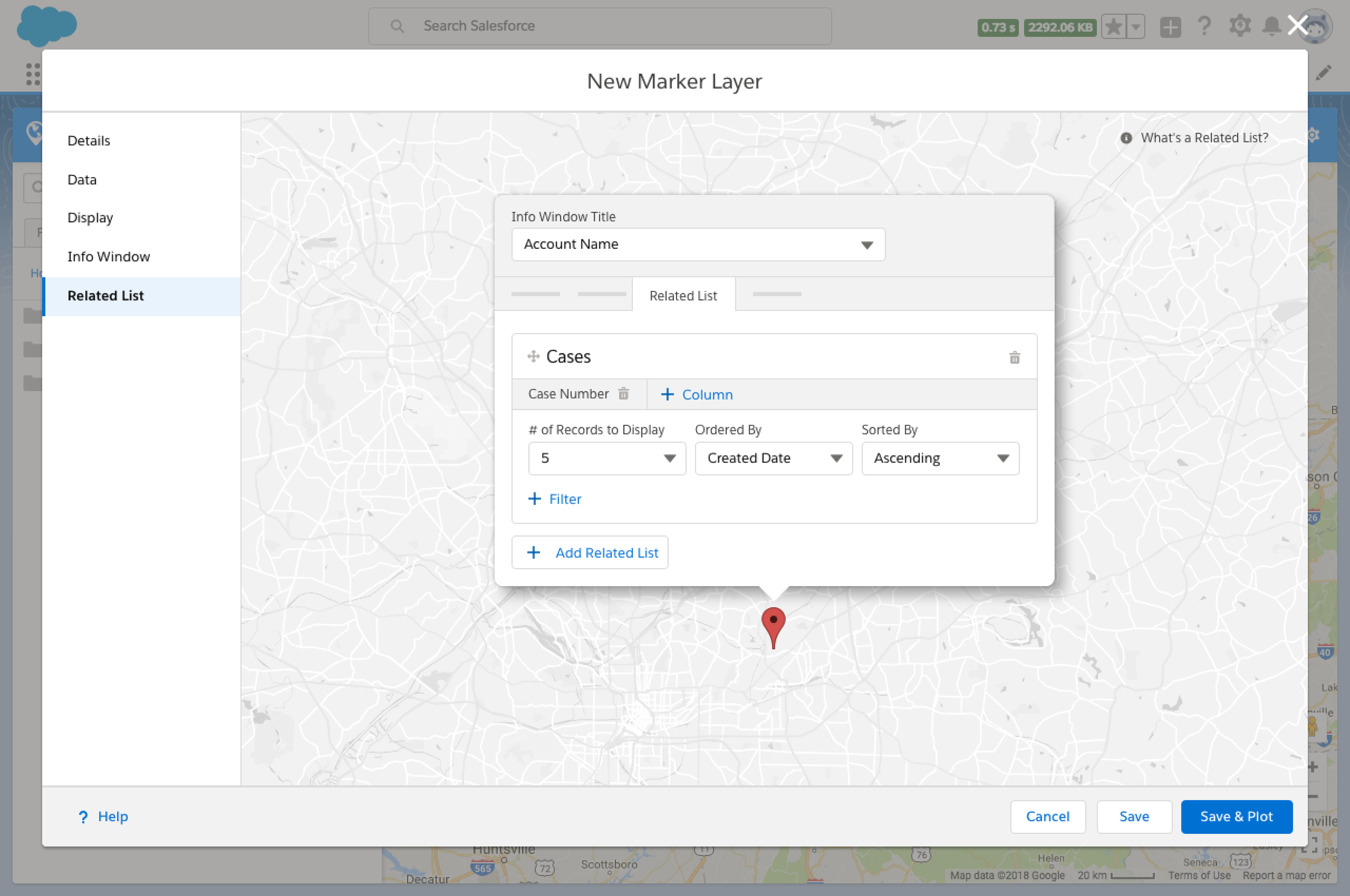
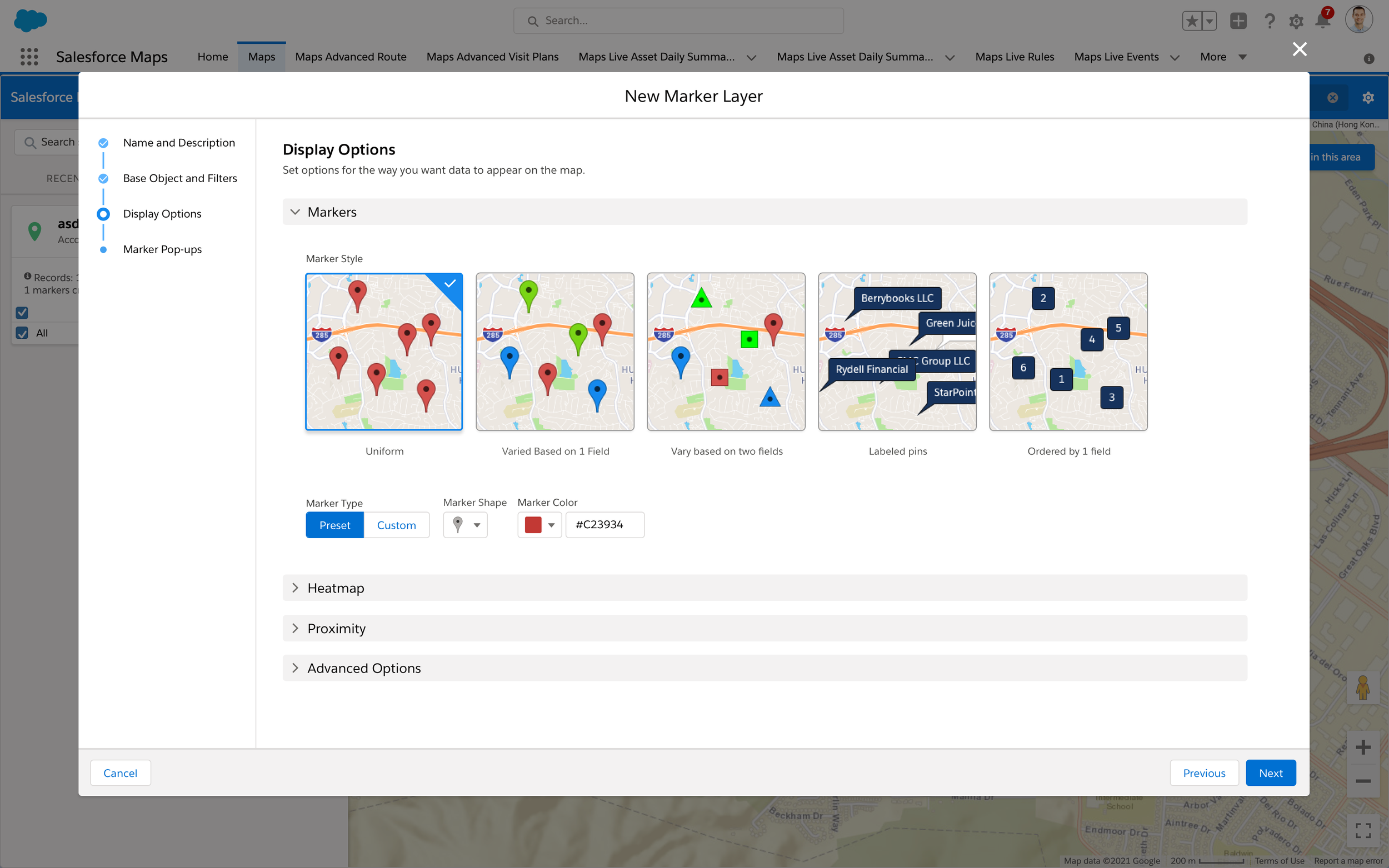
Display
Info Window
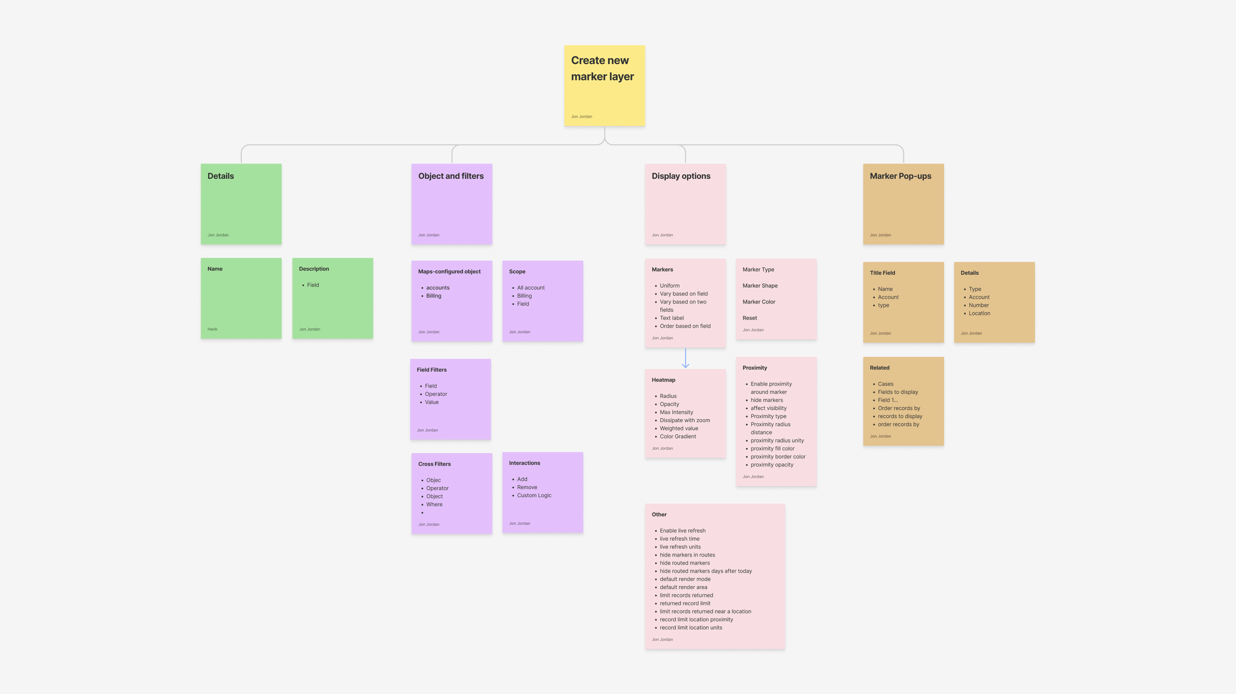
Cognitive mapping to determine interaction elements
We broke the task groups into cognitive maps to figure out what a user could do on each page, and what interaction components they would need to move through each step.
Design and Testing
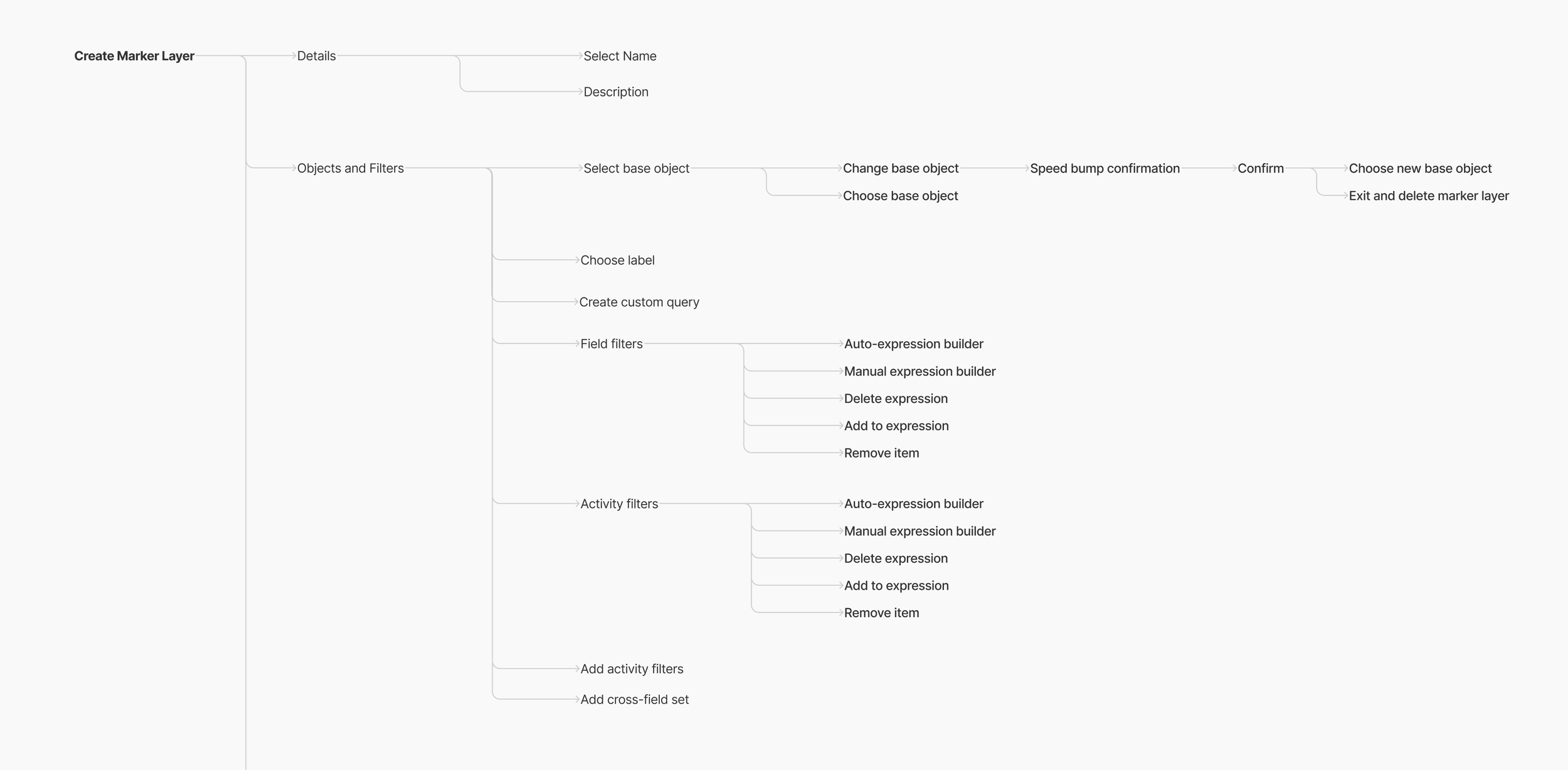
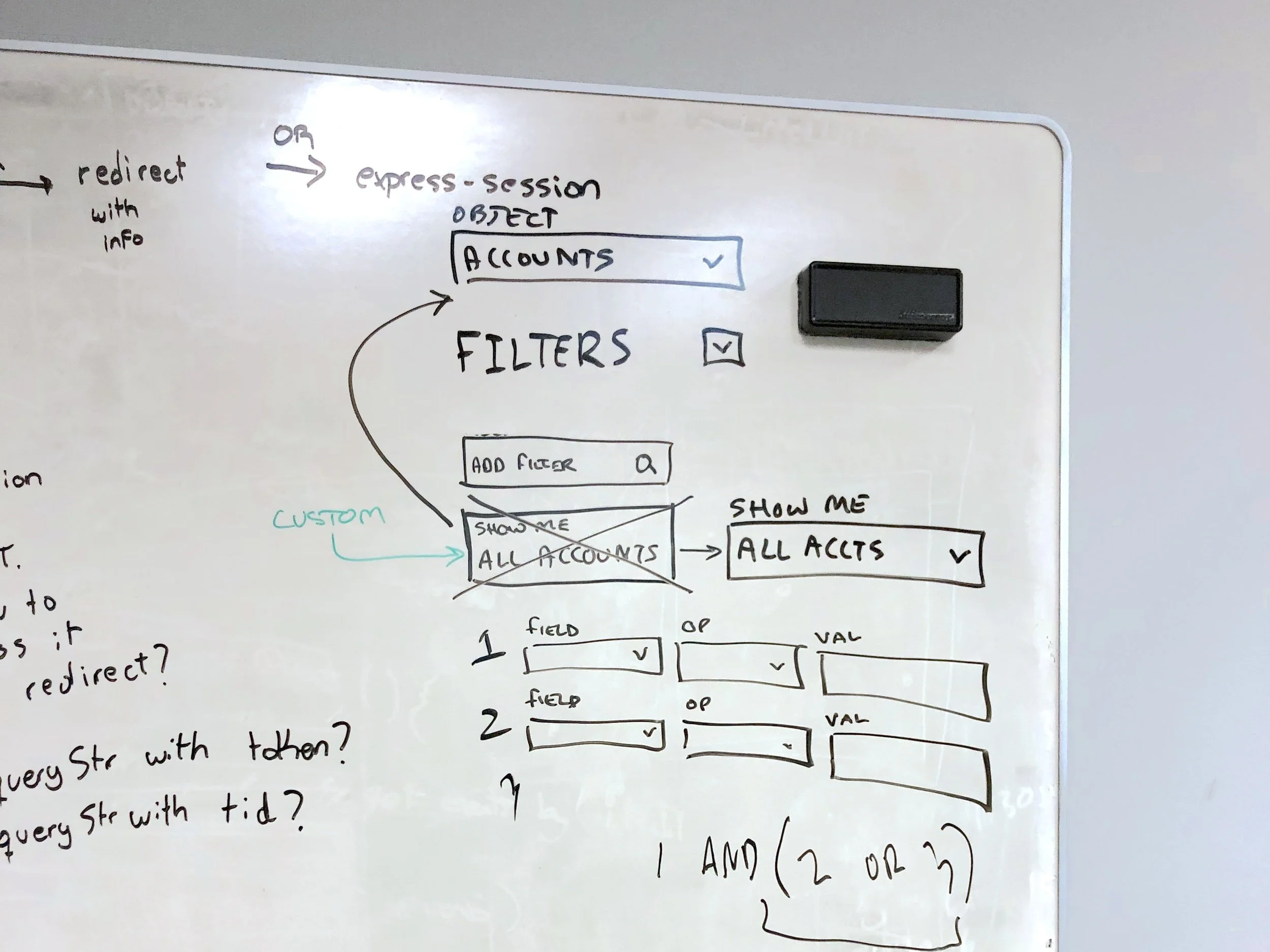
Whiteboarding
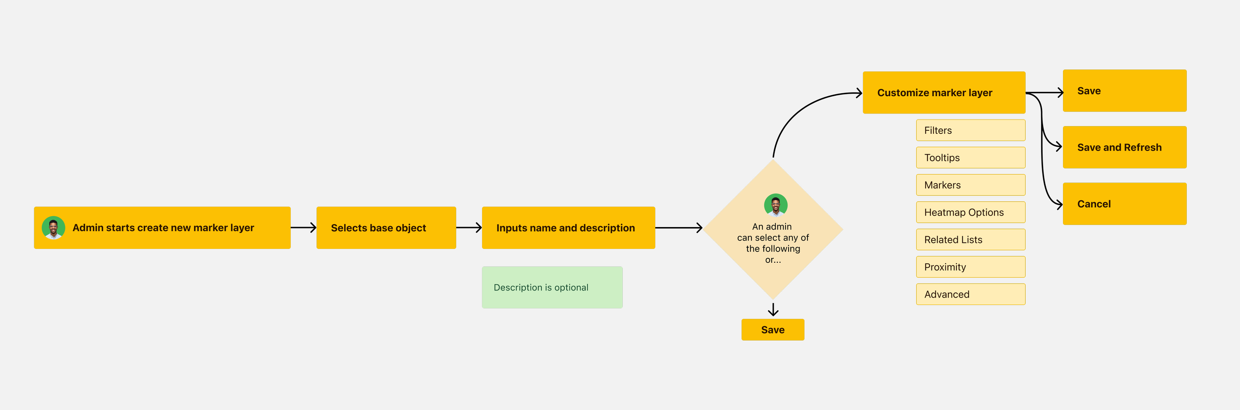
With info on what would go in each section, we conducted a whiteboarding workshop to quickly iterate on designs for layouts and components. Landed on a multi-step “wizard” modal format with each section getting its own page
Any other modal format was too cluttered
Accessibility problem: Progress indicator in the modal footer
During the workshop, we uncovered a significant problem. We needed to use a multi-step modal, but the SLDS standard modal has the progress indicator in the footer.
Provides no labels for screen readers (or sighted readers)
Tough for keyboard navigation to use because it’s at the end of a tab navigation structure

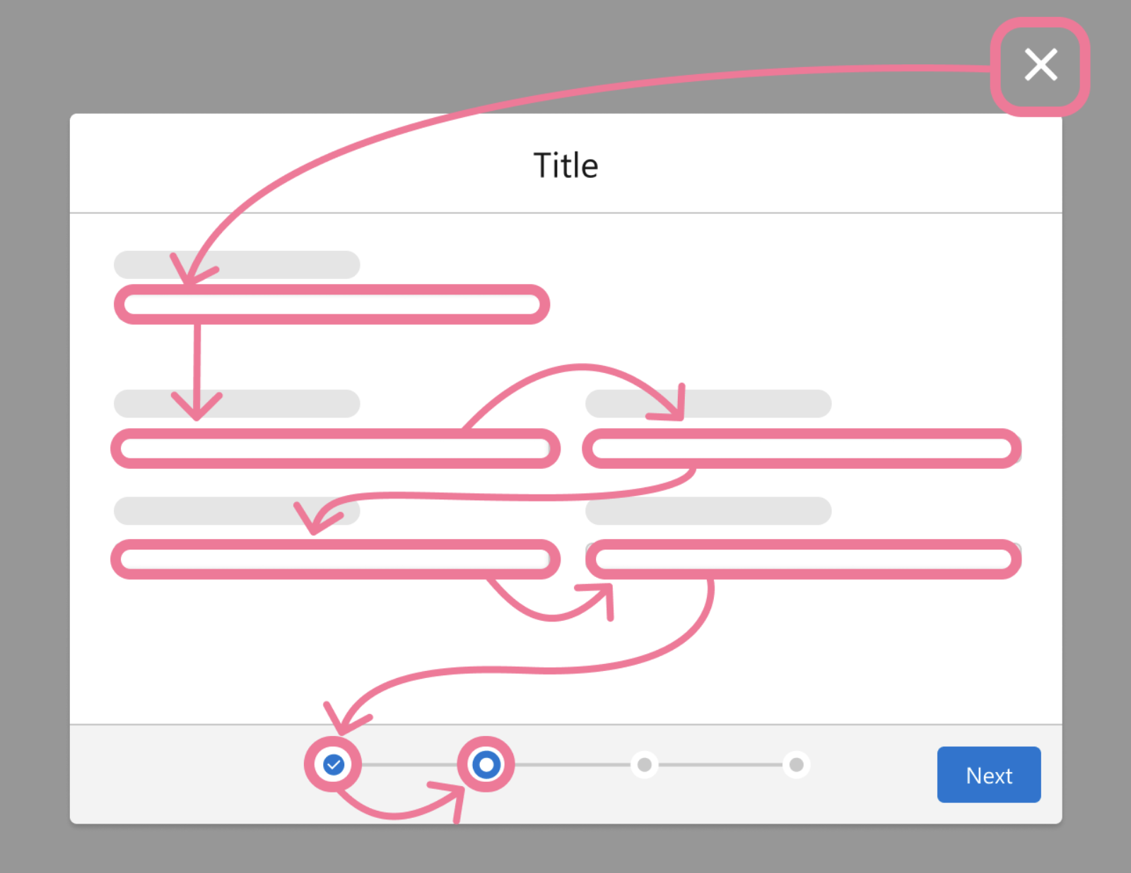
Solution: Vertical progress indicator
Exists in Salesforce design library, but rarely used
Much better for keyboard navigation, because it’s early on in the tab structure
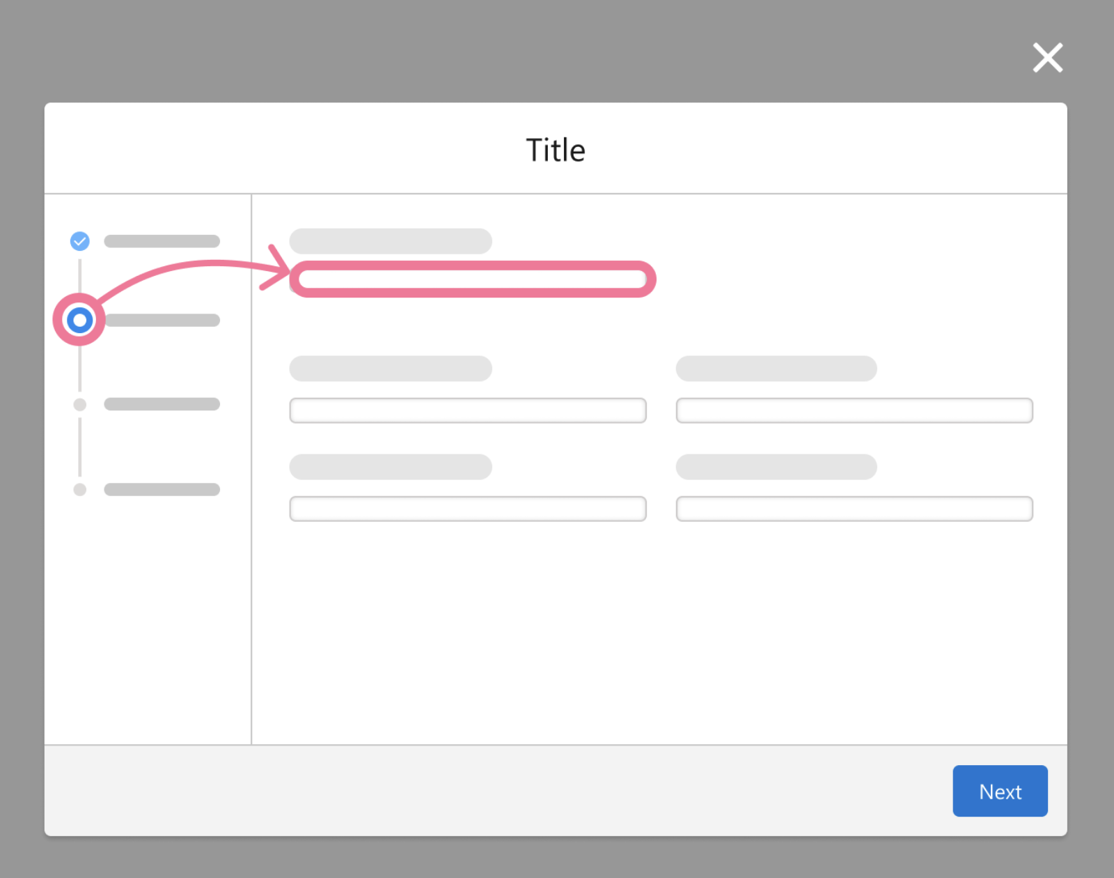
Issue: The existing pattern is technically accessible, but not fully useful - they’re read only so can’t be used for navigation
Fix: Enhance the SLDS component to make them clickable (bigger task than it sounds with an established design library)
“I honestly can’t tell you how excited I am about this. We’ve been asking to have this happen for forever. It’s amazing.”
- Cordelia, Salesforce a11y engineer
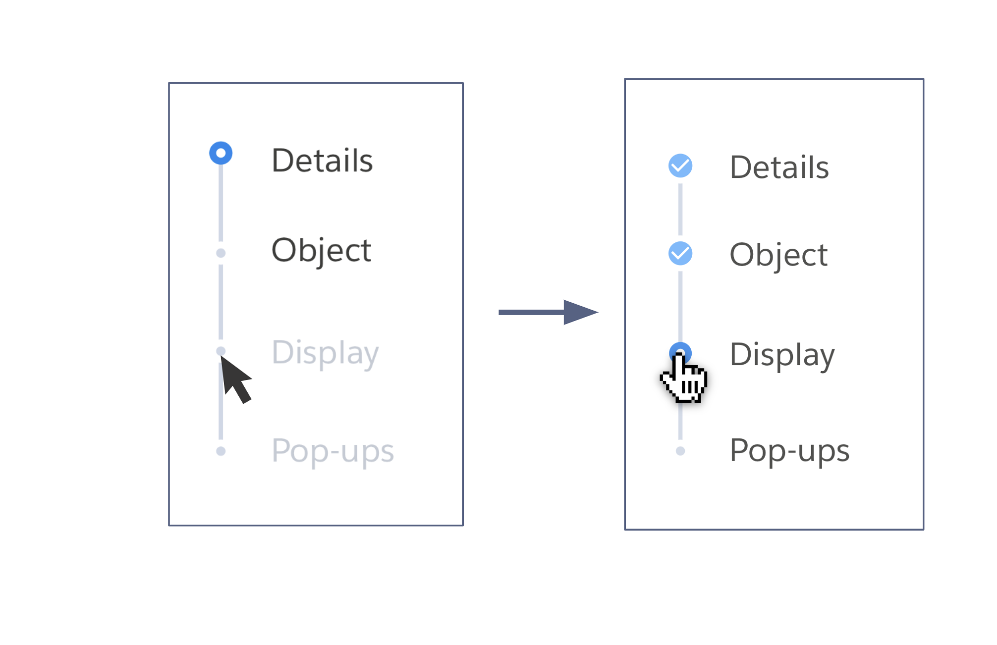
Expanding accessibility to the edit flow
Going with vertical navigation for the create flow, we had to figure out how that would affect the edit flow. Keeping the vertical progress pattern would require user to move through each step in the wizard to edit things.
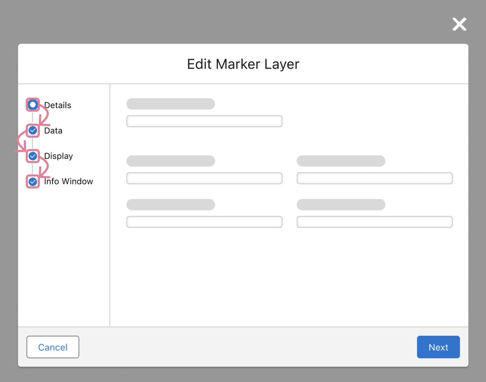
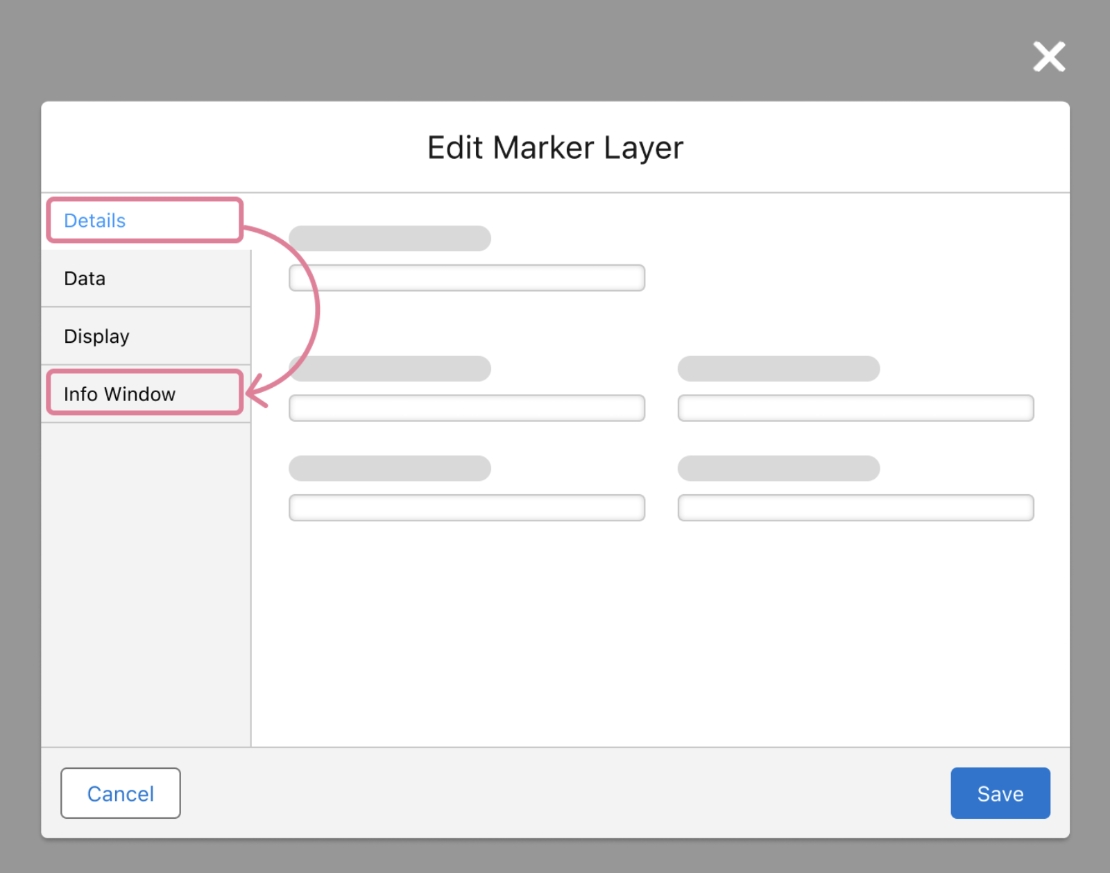
Vertical Tabs
Instead, change edit flow to vertical tab structure so a user can navigate directly to the content they want to edit. Vertical tabs exist in SLDS, but not for modals. Only on full page experiences. I made the case to leadership that the benefit to users was worth deviating from SLDS and the added engineering resourcing it would require. Got full buy-in to go ahead
Wireframing explorations
Now that we had landed on a navigation style to frame this multi-step modal, I started making wireframes to quickly iterate on layouts and interactions.

Explorations and solution engineer feedback
I made some mid-fi designs and a quick prototype to get feedback from the solution engineering team (salesforce employees that help clients set up and manage their products).
The good
All features and interaction items included
Liked that it was SLDS and provided contextual images
Structure was much easier to understand
Needed attention
UX Writing unclear
Needs more guidance for each step
Hi-fi design v1
I made a set of hi-fi designs using the input from the SE’s
Guidance text at the top of each page
Improved microcopy
Cleaned up sections by putting accordion default state to closed

Usability testing
I made a prototype out of the hi-fi designs and did usability testing with two groups of Salesforce customers: existing Maps customers, and customers who had never used Maps or the marker layer builder.
The new designs were such a shift in experience that we needed to make sure previous users could make the transition, and that new users were able to complete tasks without previous knowledge of the product.
Usability study insights
Task flows and interactions were easy to understand:
Users were able to complete 83% of all tasks given with no additional prompting, even users with no familiarity with maps
UI Text still needed revision:
That 17% of prompted tasks were able to be completed after user clarified the meaning of certain terms. We needed to remove as much jargon as possible

UI Text Workshop
Set up a workshop with CX and a PM to go through the UI text with a fine toothed comb. Specific attention paid to the text flagged during the usability tests
Final design
To finish things off, we ran everything through final checks with the accessibility team and the engineers to do a final ok for tech feasibility. The product is now live for customers.
Effect on Salesforce’s business
38.59% increase in daily active users
20% y/y growth in revenue
Related
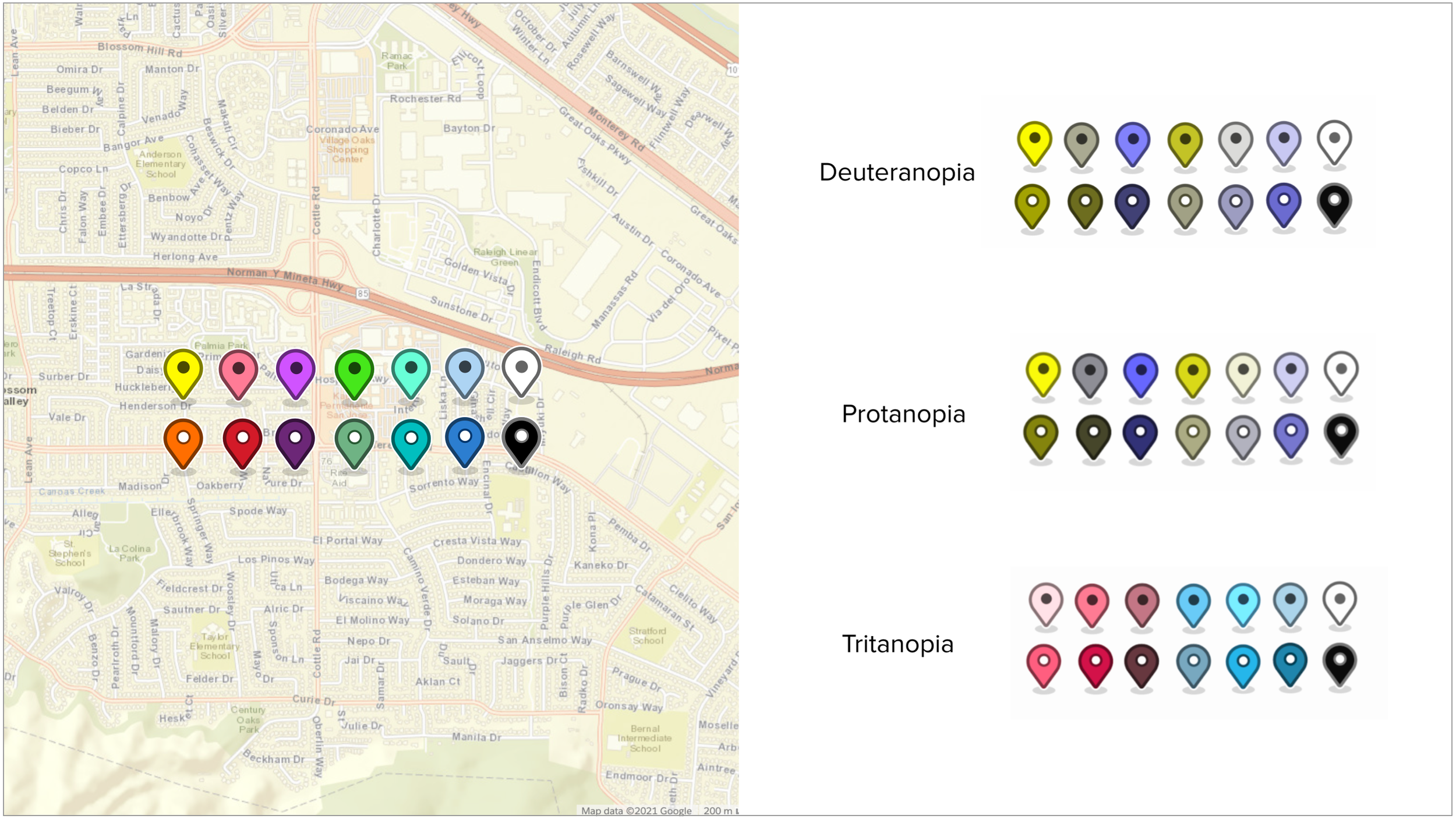
Additional accessibility feature: Map Markers
Check out one of my other portfolio pieces to see how I developed high contrast map markers and color-blind friendly color palette. They both got added into the marker layer builder, and are now used across the product.
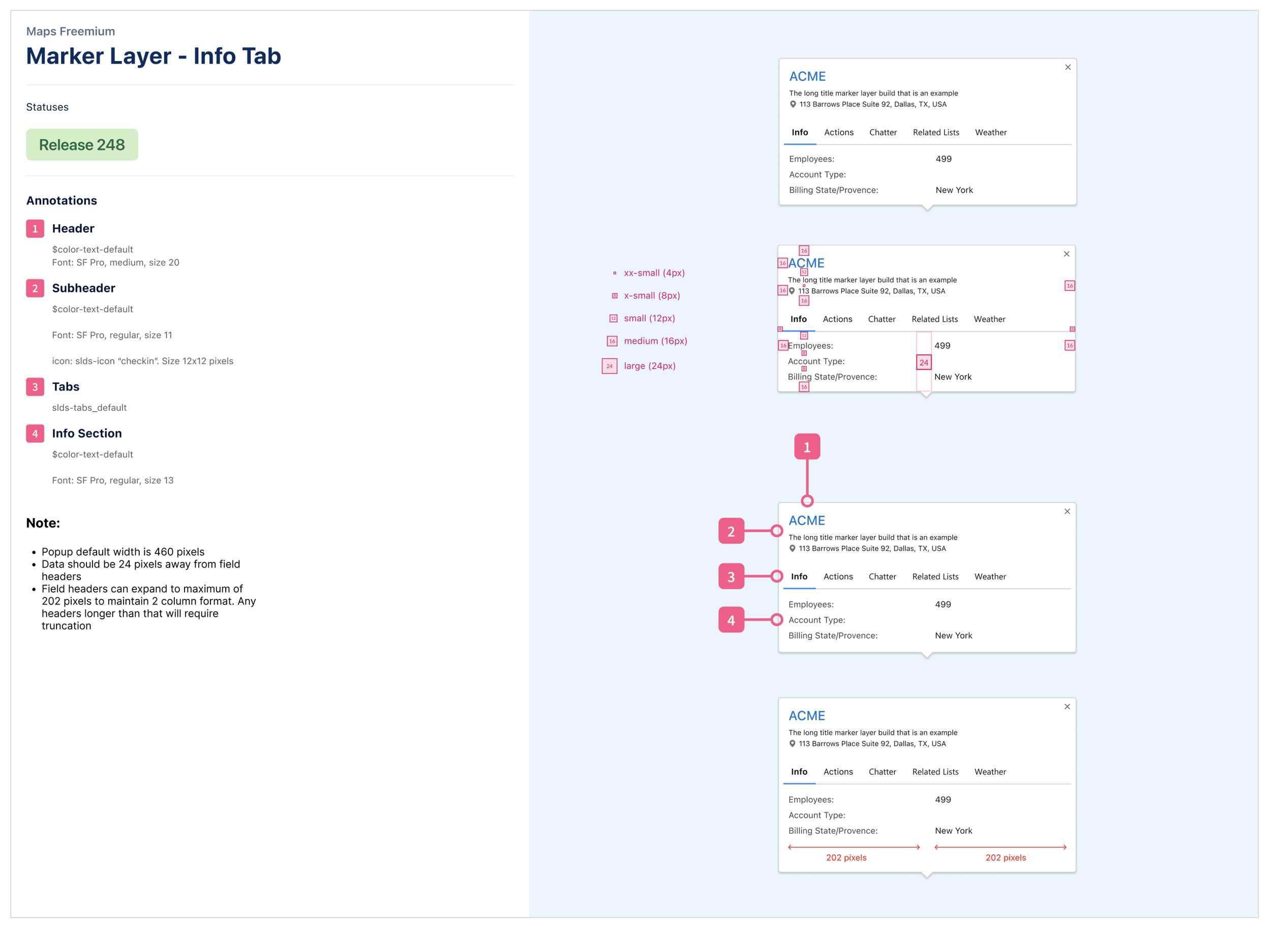
Update of pop-up map windows
After launch, we had an additional request to revise the info pop-up windows that appear when you click a map marker. That project was interesting because I had to learn the tech requirements for a different mapping program that they would be sourced from.